Ascend
Role UI/UX Designer
Tools Figma, Google Suite
Timeline January - April 2023
Team PM, Co-Designer, Software Analysts
Ascend shares statistics to inform job seekers about the recruitment process without needing an extensive network.
I collaborated with another UX designer to redesign their website to be easier to navigate, strengthen their brand voice, and gain viewership.
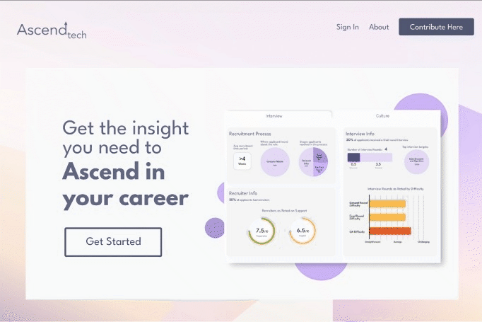
My work spanned across the landing page, surveys, and login page, with much of my learning stemming from improving the data visualizations on the company profile pages.
beginning
With the fall season comes pumpkin bagels and young professionals preparing for job recruitment.
They scour LinkedIn and draft cold emails, polish another resume and connect with people in their dream roles. But this also comes with a cost--LinkedIn premium, taking time outside of classes and jobs, all of which are privileges not everyone can afford.
Ascend makes recruitment research more accessible. They survey employees and compile data in one place, so applicants can prepare for interviews on the same playing field. Now, it was just a matter of making that data visible—which is where my team came in.
problem
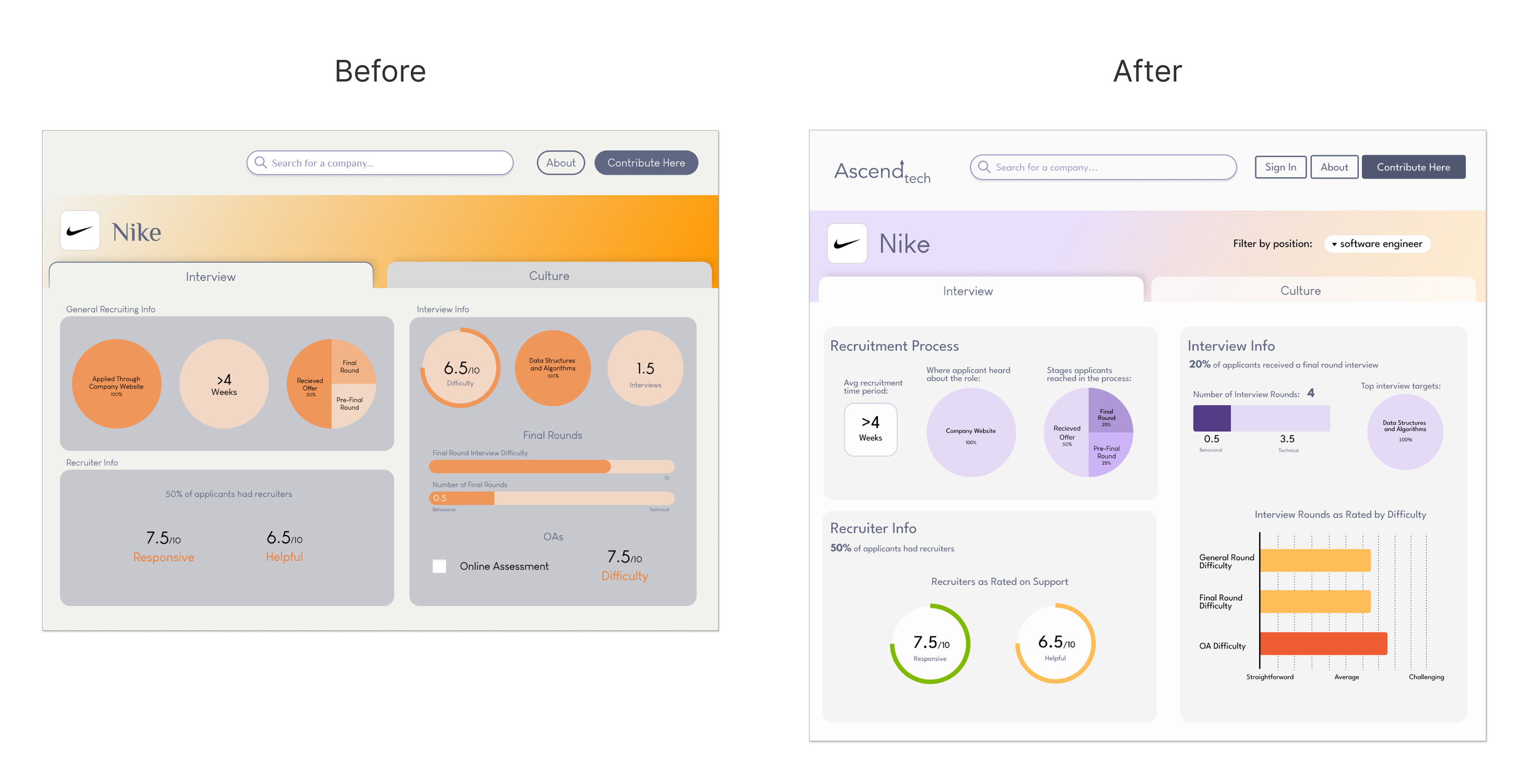
When surveying the existing site I made a few observations, with one being the alarming number of pie charts.
A first look at Ascend's webpages.
Each surveyed company had its own Company Profile Page for their categorized responses.
It contained blocks of charts that were difficult to interpret and swaths of color that spoke to the brand, but didn't emphasize the key information that Ascend had to offer.
My Goal
Present Ascend's survey data in an approachable and scannable manner.
ideation
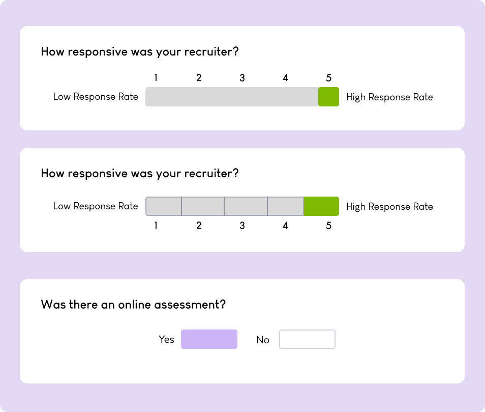
As Ascend collects data based on Likert scales, I focused on presenting those results most effectively. I did a competitive analysis on Niche and Rate My Professors:
Niche
• Familiar metrics with report card style grading
• Intentionally associated colors, such as green for a positive grade
• Limit information overload with key categories at the top and an expandable view below

Rate My Professors
• Clear information hierarchy defined by text size and visual grouping
• Ratings with associated colors
• Labels and icons give viewers context for each rating

From this, I determined that the redesign needed clearer visual cues, such as meaningful colors and larger titles to guide attention, with different charts to highlight distinct data points.
iteration
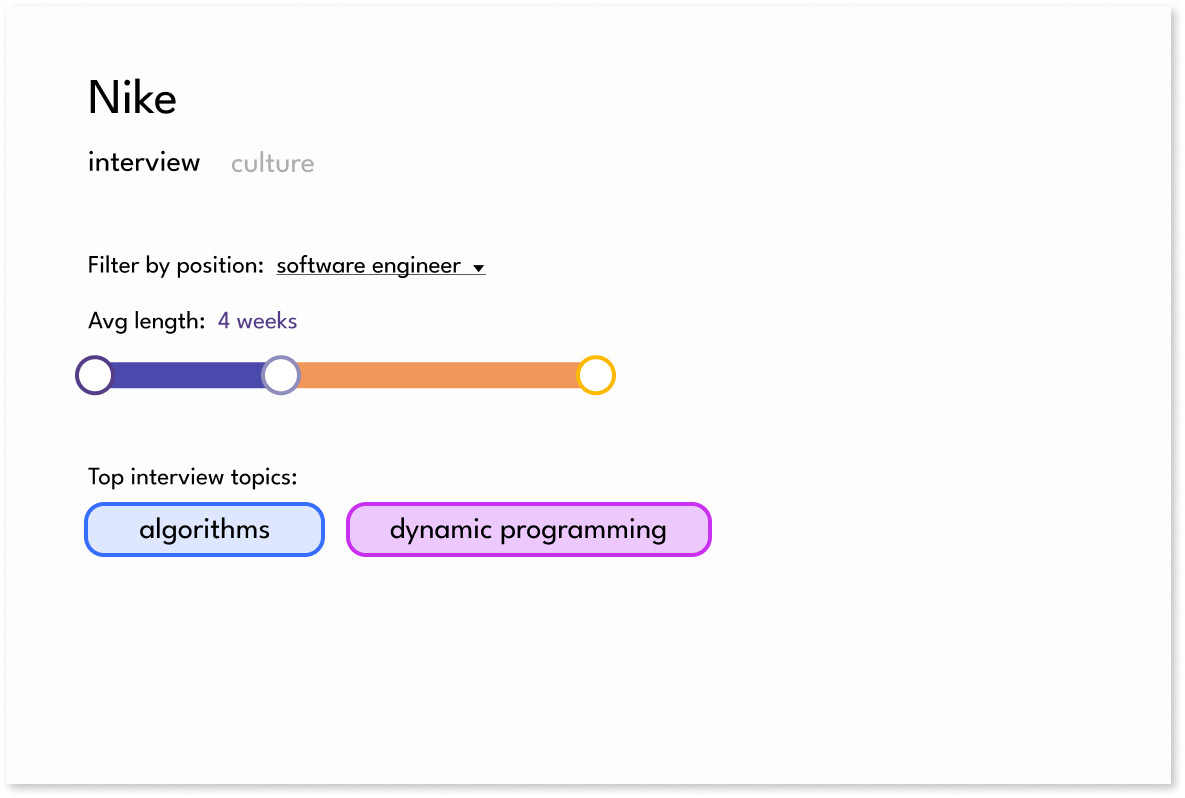
The first draft of a new company page.
The Idea💡
• Minimal elements
• Lengthen the page and break content into vertical chunks
• Filter data by position, so viewers could find the data most applicable to their career path
The Drawbacks ⛔
• Relies on blocks of text which are difficult to scan and disengaging for new viewers
• Didn't utilize brand feel from the home page (which my wonderful co-designer was creating), and thus it didn't feel as inviting or cohesive
The Idea💡
• Colors consistent with home page
• Confirm color contrast is legible for a wide audience
• Use color to support insight, as seen in competitive analysis
The Drawbacks ⛔
• Pie graphs took up large areas and didn't clearly differentiate data
• Section headings got lost, and the context for each chart was still difficult to extract overall
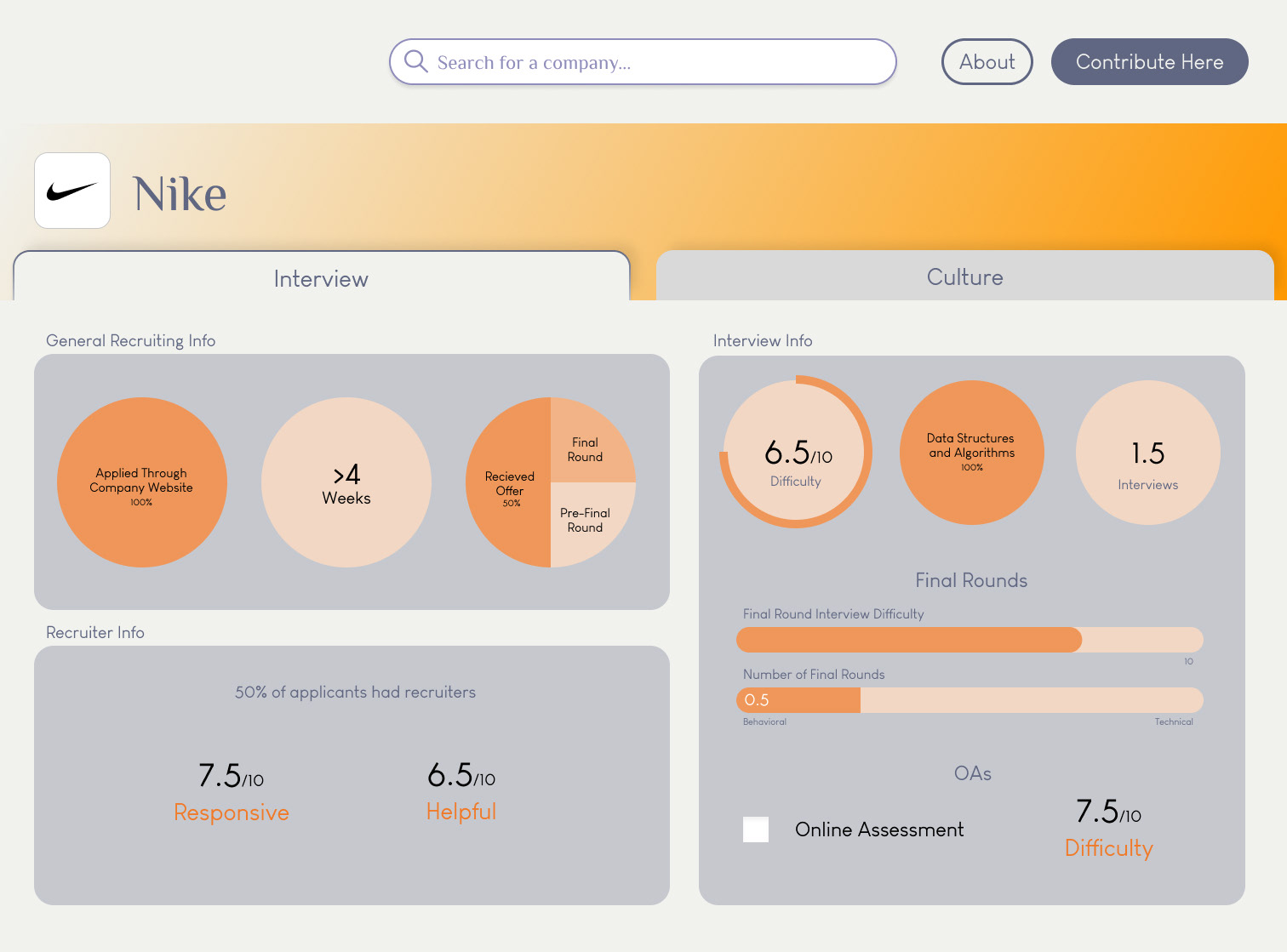
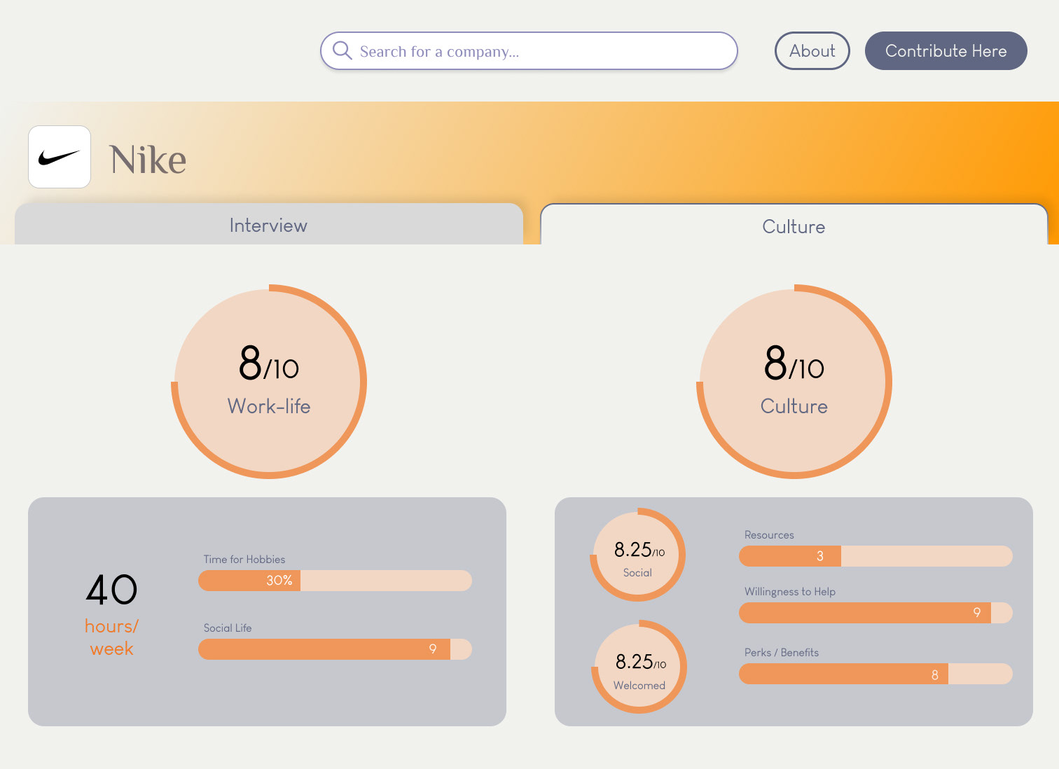
The second iteration with new colors and large charts.
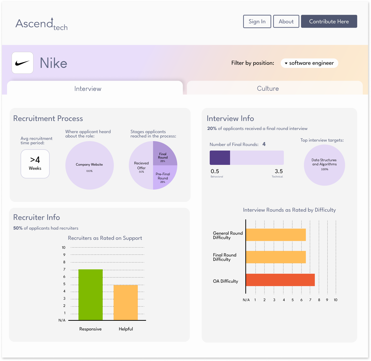
The third iteration with different charts and clarified text hierarchy.
From there I iterated on the previous mockup with feedback from stakeholders and new ideas for data visualizations.
The Idea💡
• Relate metrics with bar charts
• Enlarge headings, add descriptors for each chart
• Add position filtering from the first draft
The Drawbacks?
Well . . .
While I was satisfied with how the design appeared, I presented it to the client and realized that some improvements that would better support users in ways I hadn't considered.
For example, stakeholders shared that "Recruiter Info" would be better shown in pie charts rather than a bar graph, as rating recruiters as "Responsive" and "Helpful" were not meant to be compared together, but rather as distinct categories.
Additionally, in the bar graph on Interview Rounds, I associated the x-axis with numbers to make ratings quantifiable. The client suggested that it might be better to use labels such as "Average" and "Challenging" instead, as this is how their rating was intended to be understood.
In both cases, receiving feedback from the client helped to clarify my own misconceptions about what value to highlight in the survey data. It opened pathways for improvements that aligned with the company's vision, and it supported the user's understanding of the content.
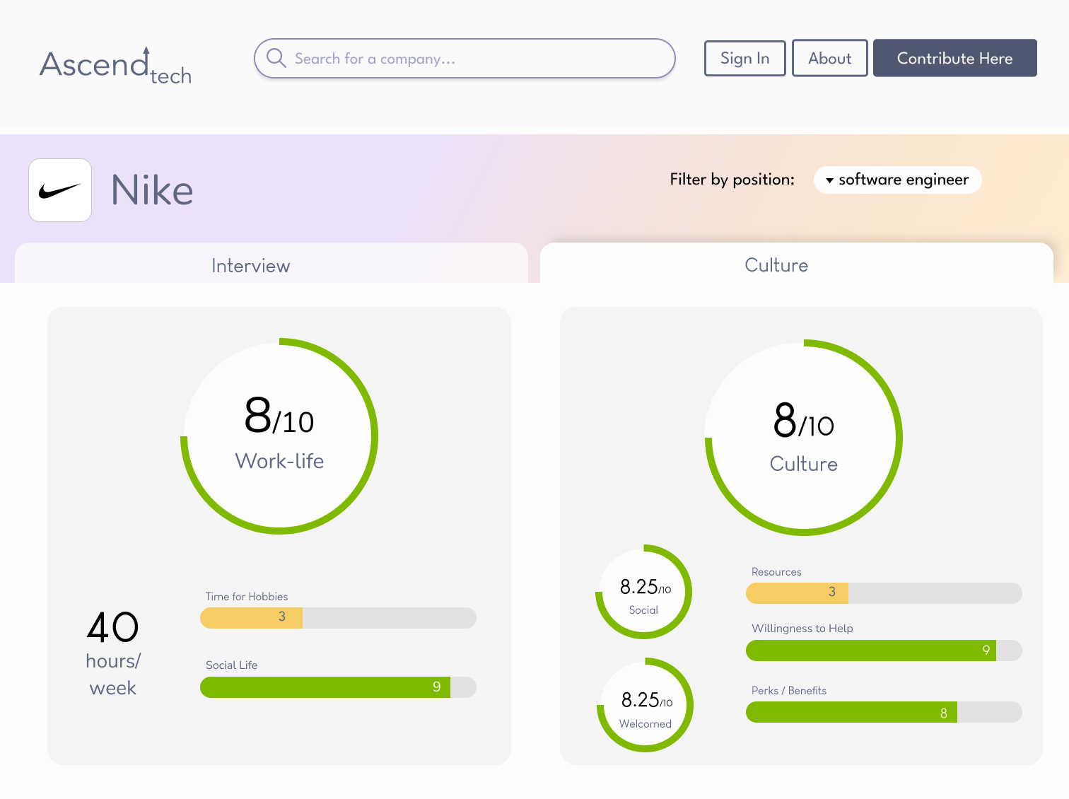
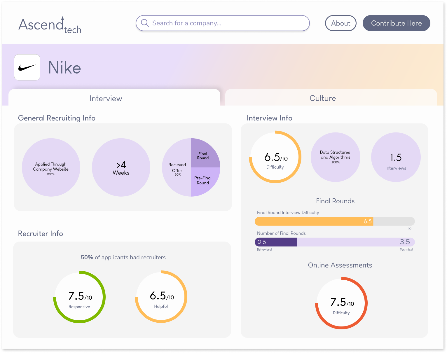
Thus we came to the final iteration of the Company Profile Page:
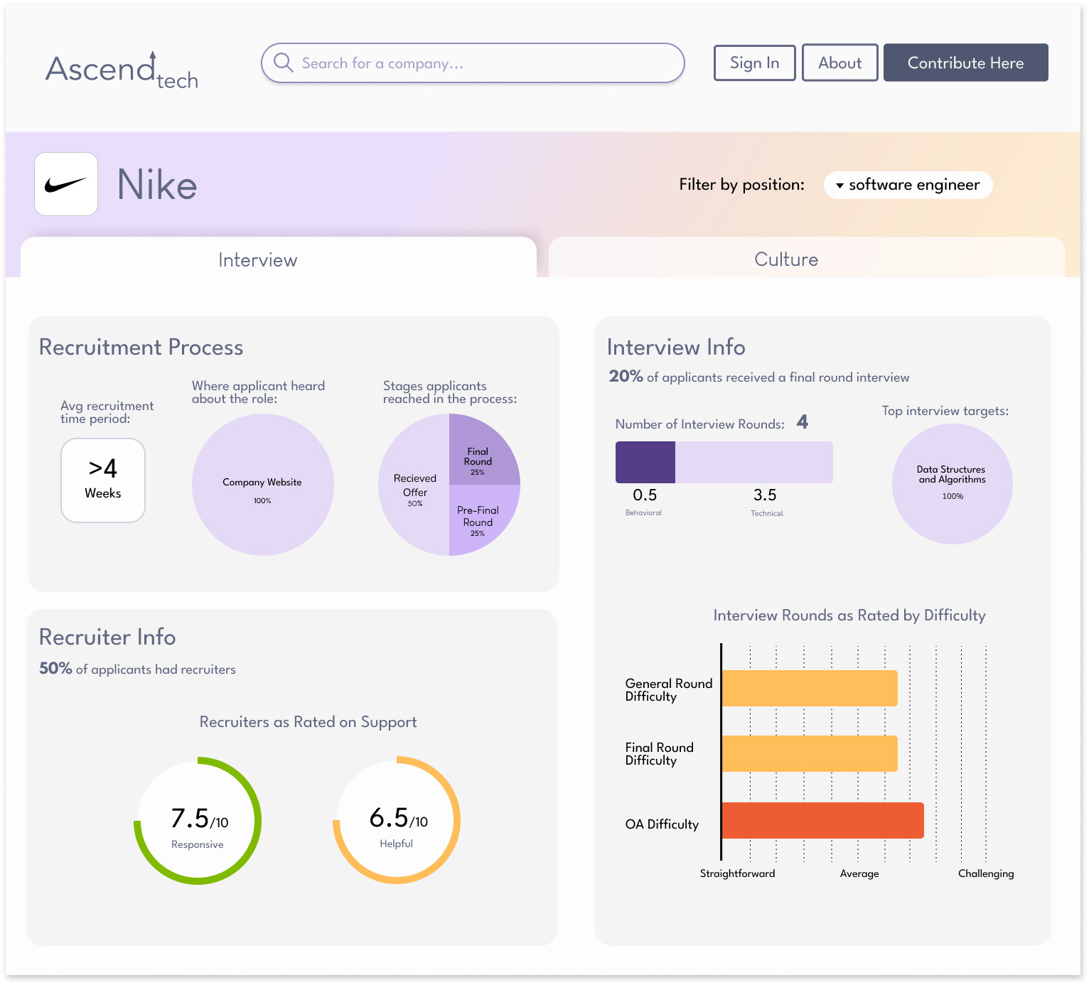
The fourth and final iteration of the Company Profile Page.
takeaways
Design is not a solo endeavor
Not only does the user determine the focus of the design, but the client and my team members all provide valuable perspectives on the intention for the product and how it can be more effectively designed for their audience.
More user testing, earlier
While I recognized that the existing data visualizations were unclear, more radical and helpful changes might've been implemented had I utilized a card-sorting activity or similar test early in the design process to better understand how data could be categorized more intuitively.
Start in greyscale
I would aim to begin wireframing with low-fidelity sketches in greyscale, limiting my reliance on color to make connections between data and improve the overall accessibility of this page.
additional design work