Application Portal
Atlas Digital Consulting Group
Role
Lead UX Designer
Team
Seo Jun Yoon, SWE
John Xie, PM & SWE
Skills
Figma, High-Fidelity Prototyping, User Research,
Interaction Design, Web Design
Timeline
5 weeks, Launched January 2025
Overview
Atlas Digital released their application portal in beta in Fall 2024, receiving hundreds of applications in its launch. For the upcoming recruitment cycle, they aimed to improve upon usability issues raised during the first release and ensure that the portal could stand alone as a replacement to traditional recruitment systems.
I led the design direction of the website and collaborated with developers to launch the applicant-side view in 3 weeks, then the member-side view the week after.
In its launch the portal garnered 300+ applications and successfully supported the team in receiving and reviewing applications throughout the recruitment cycle.
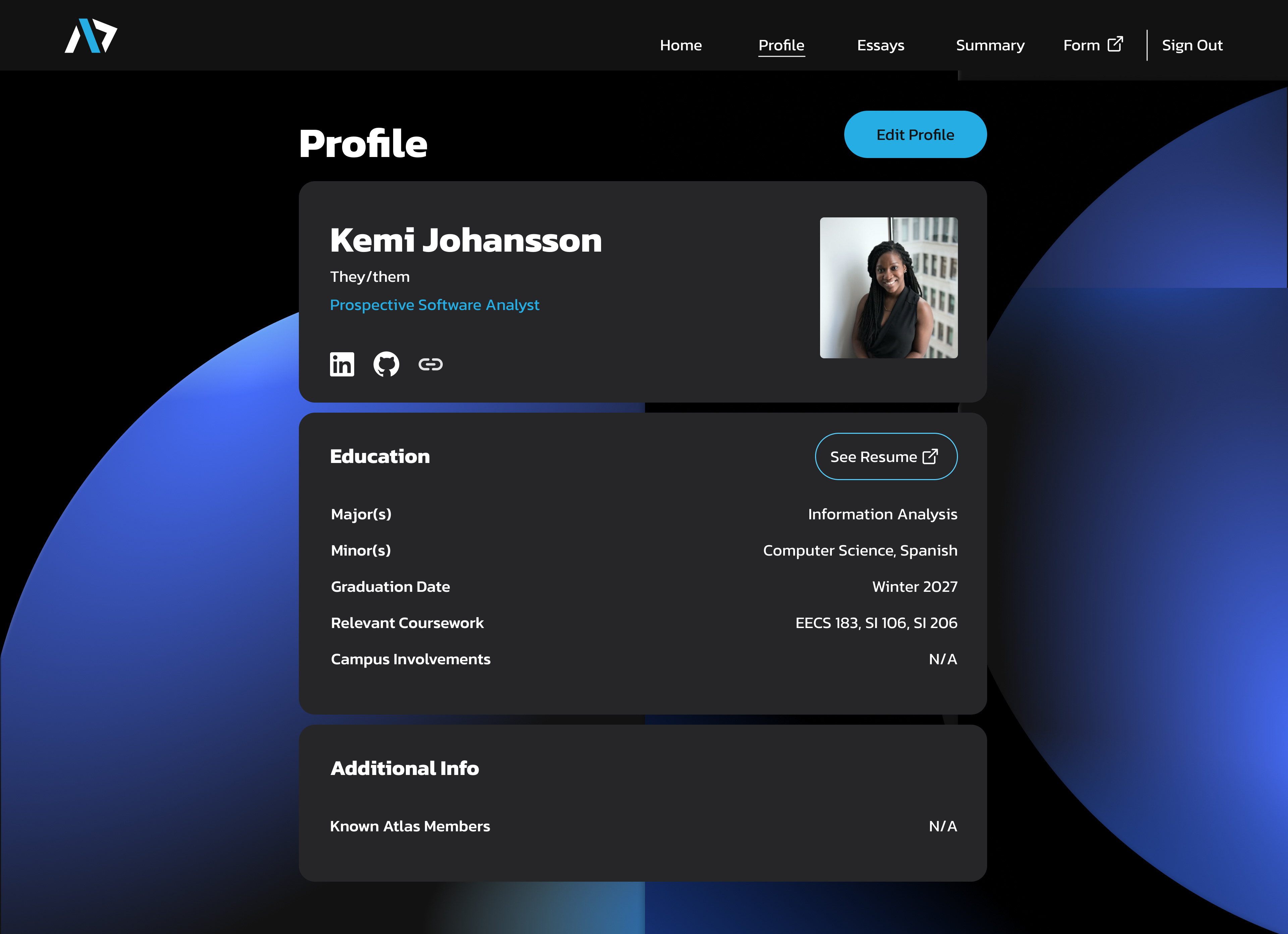
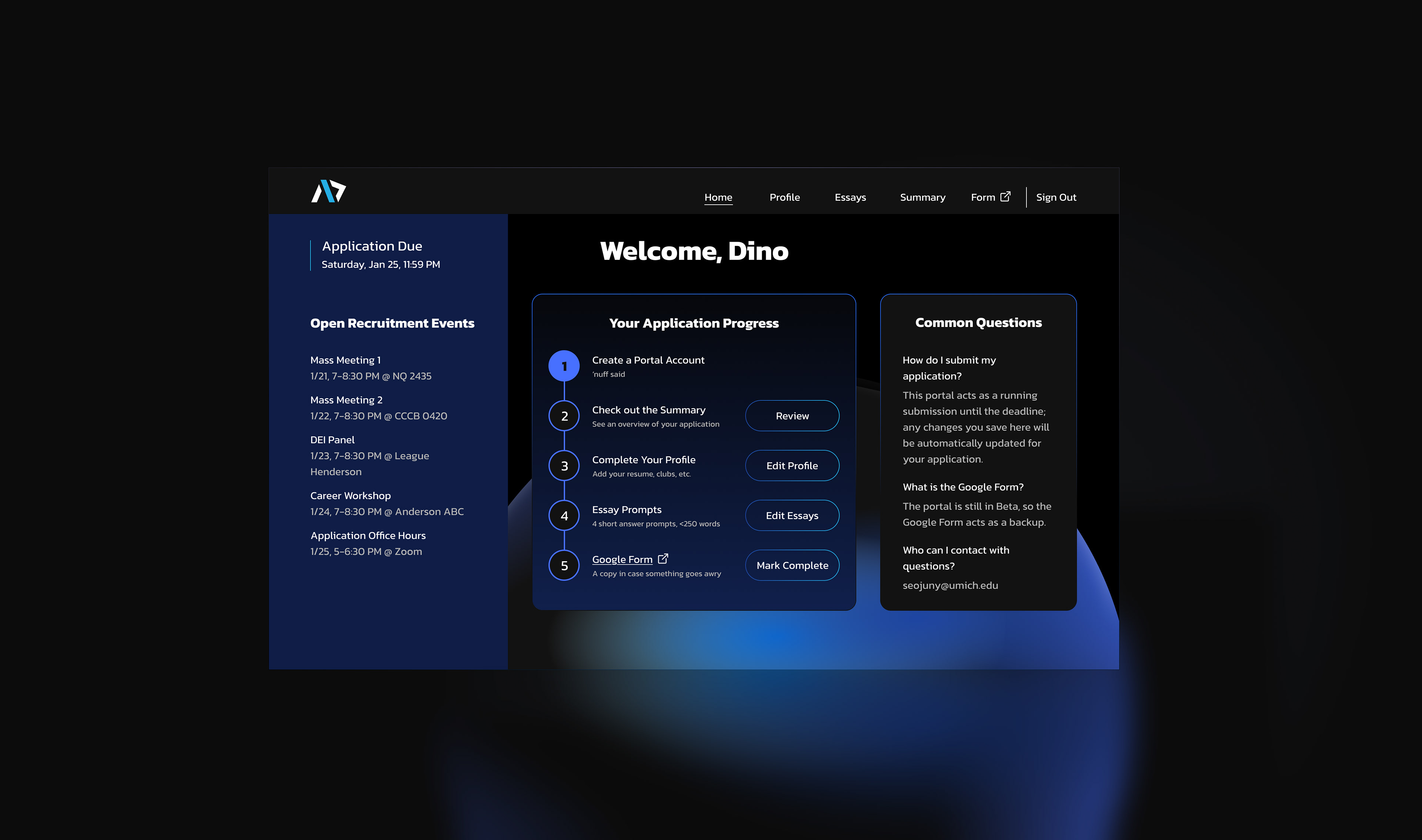
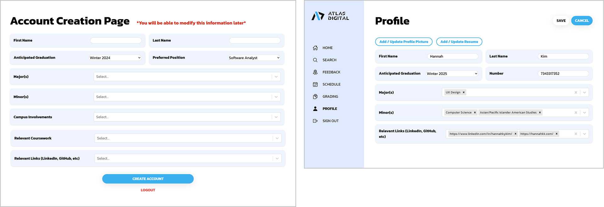
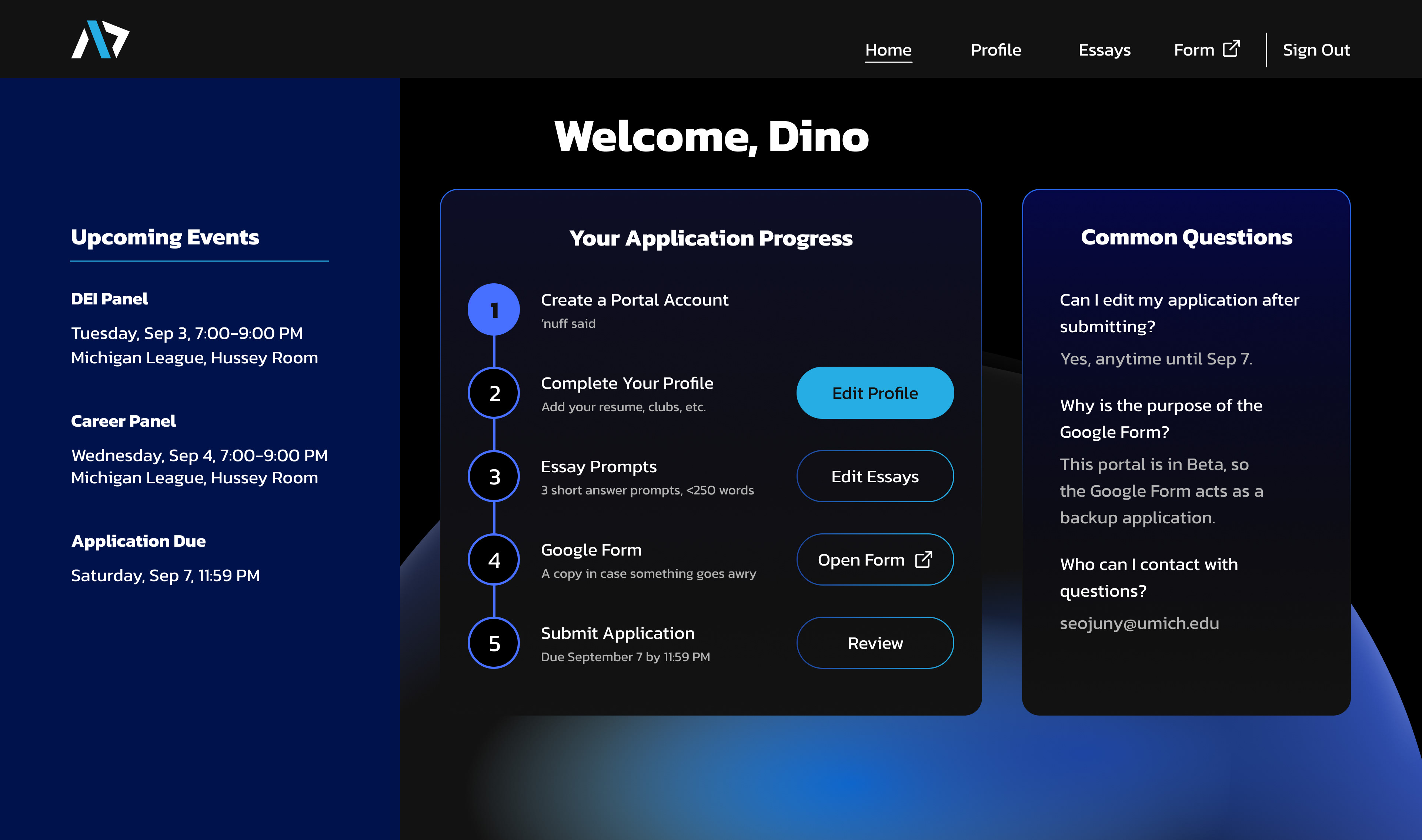
The Profile page provides a snapshot of applicants.
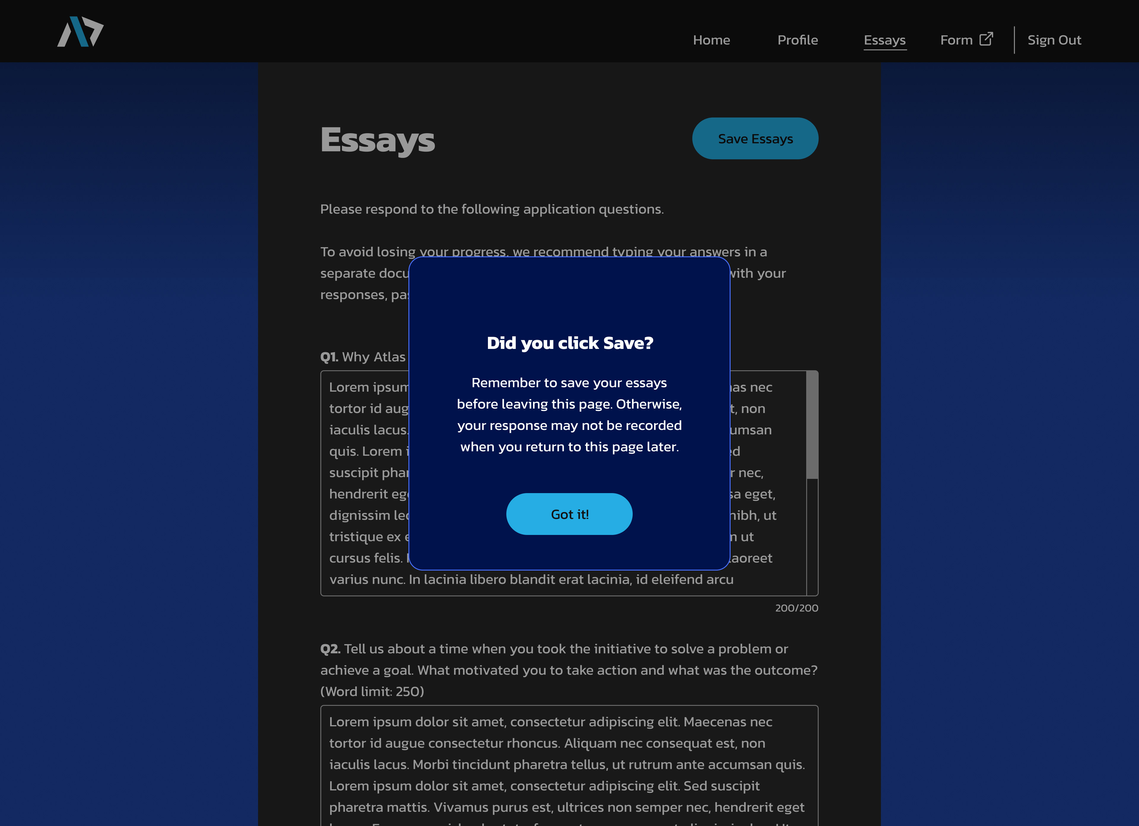
An alert reminds applicants to save their essays, reducing frustration and error.
UI components create consistency across the portal.
Beginning
In its debut, the application portal was released along with a space to provide feedback.
It’s safe to say that there was some frustrations with the current application experience.
Several people had lost their essay progress upon navigating to a new tab or closing their laptop; others felt confused as to how to track their completion of their application. Even more struggled to update their profile with accurate information, given unfamiliar UI elements and a lack of guiding messaging.
Several people had lost their essay progress upon navigating to a new tab or closing their laptop; others felt confused as to how to track their completion of their application. Even more struggled to update their profile with accurate information, given unfamiliar UI elements and a lack of guiding messaging.
Feedback from 232 respondents showed:
14% had difficulty tracking progress
16% had difficulty saving their essays
18% had difficulty updating their profile
In order for the application portal to be ready to stand on its own, it would need to give applicants confidence that their work was being saved.
The Goal
Help applicants complete their application completely and accurately.

Constraint 1 - Tight Launch Date
All changes to the applicant-side would need to be done in time for the next recruitment cycle, which would begin a week after Winter Break.
Constraint 2 - Limited Existing Resources
While there was a Figma file with a few screens from the previous release, there was no established design system; all elements would need to be formalized along the way.
While there was a Figma file with a few screens from the previous release, there was no established design system; all elements would need to be formalized along the way.
Issue 1:
Ambiguous Progress
Laid out linearly, the application steps seem simple . . .
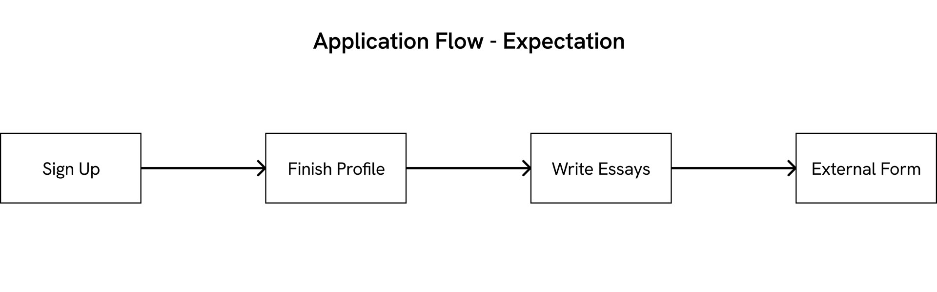
But in reality, users could complete application materials in any order, meaning the process looked more like this:

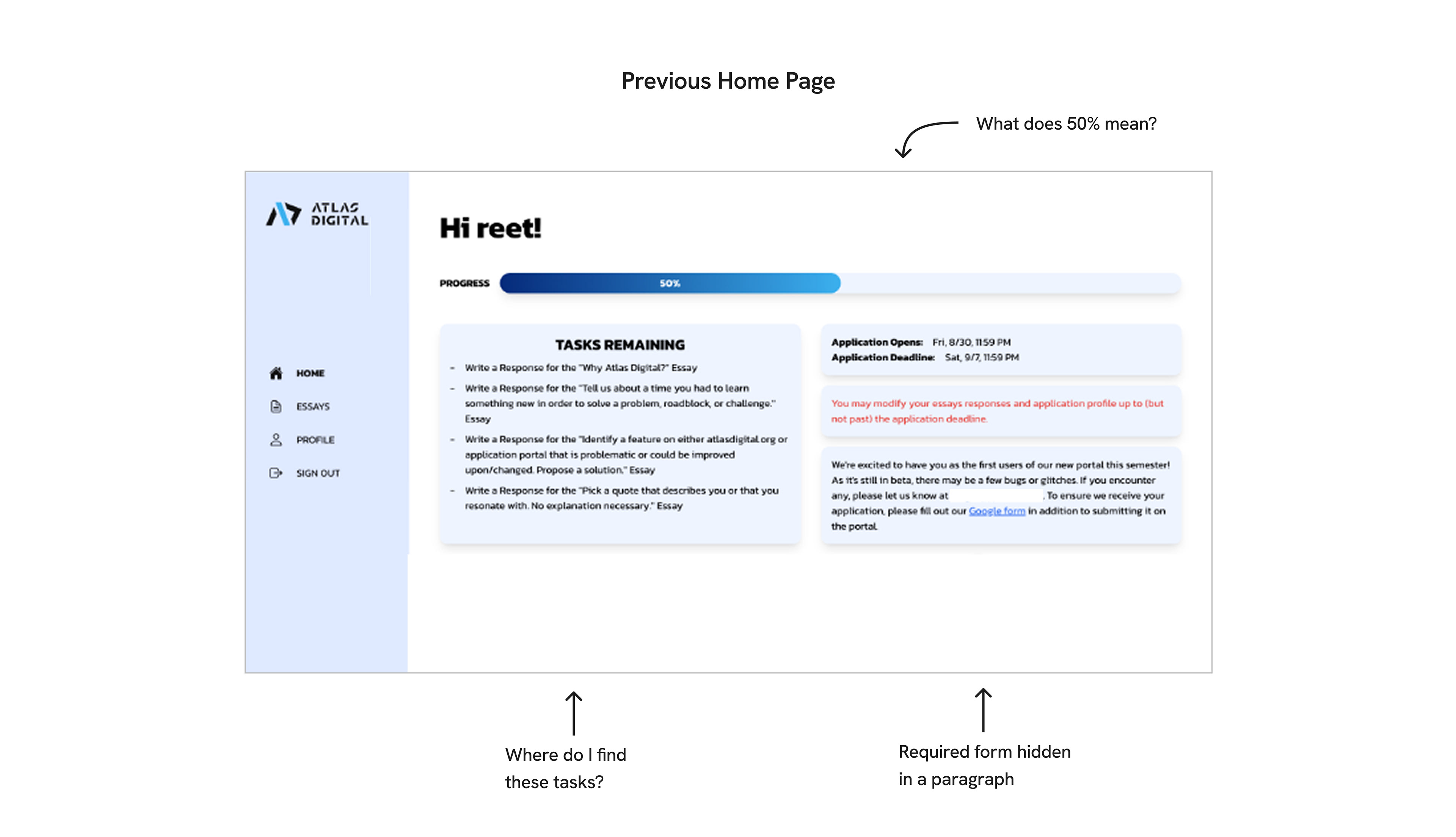
The current home page describes the submission flow in writing, but the progress bar and “Tasks Remaining” sections lack context and visual CTAs, leading people to miss updating their profile information or completing the external form.
To clarify what information needs to be completed, I explored a few different layouts with step-by-step guides. Text was limited to one-line descriptions to reduce information overload and instead summarize the overarching process.
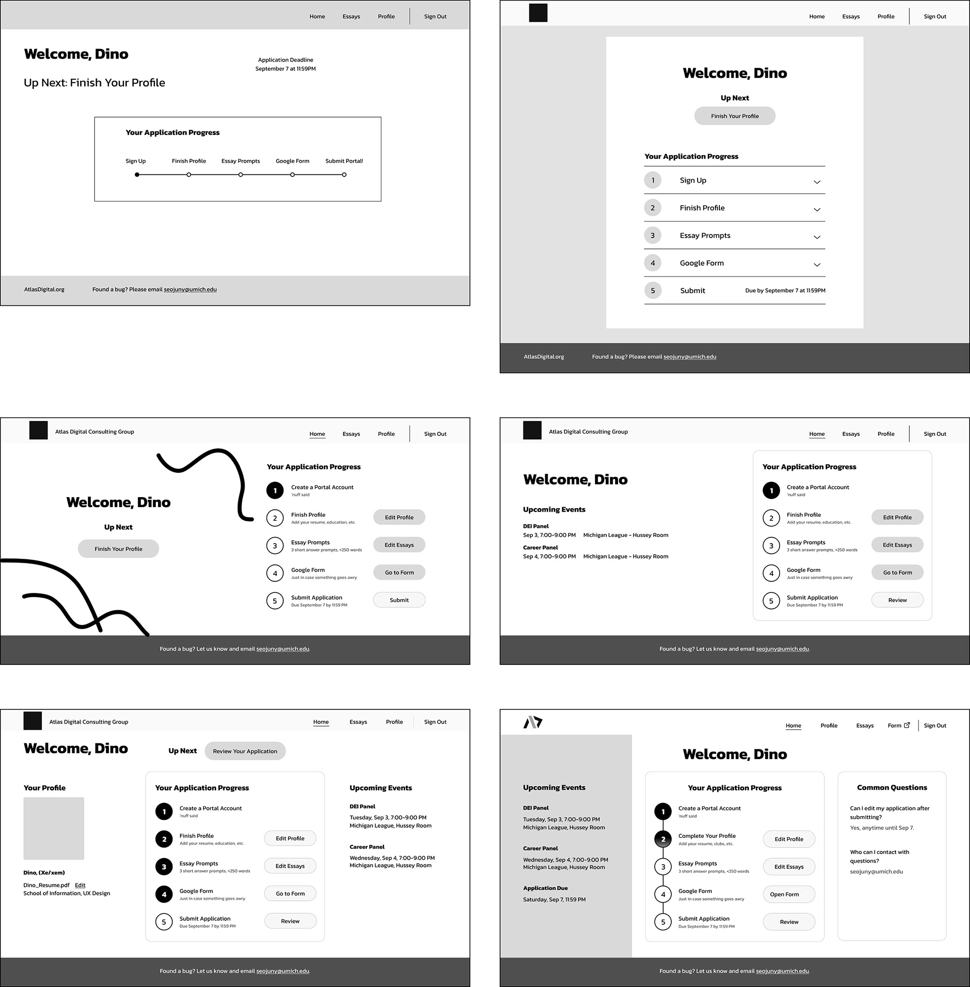
Explorations for the Home page
I ended up moving forward with the last layout for a few reasons:
+ Clear call to action
+ Upcoming Events section, as we had feedback that people wanted a way to see future events and connect with members
+ Filled in bubbles create a sense of progress and encourage people to finish what they began
+ Clear call to action
+ Upcoming Events section, as we had feedback that people wanted a way to see future events and connect with members
+ Filled in bubbles create a sense of progress and encourage people to finish what they began
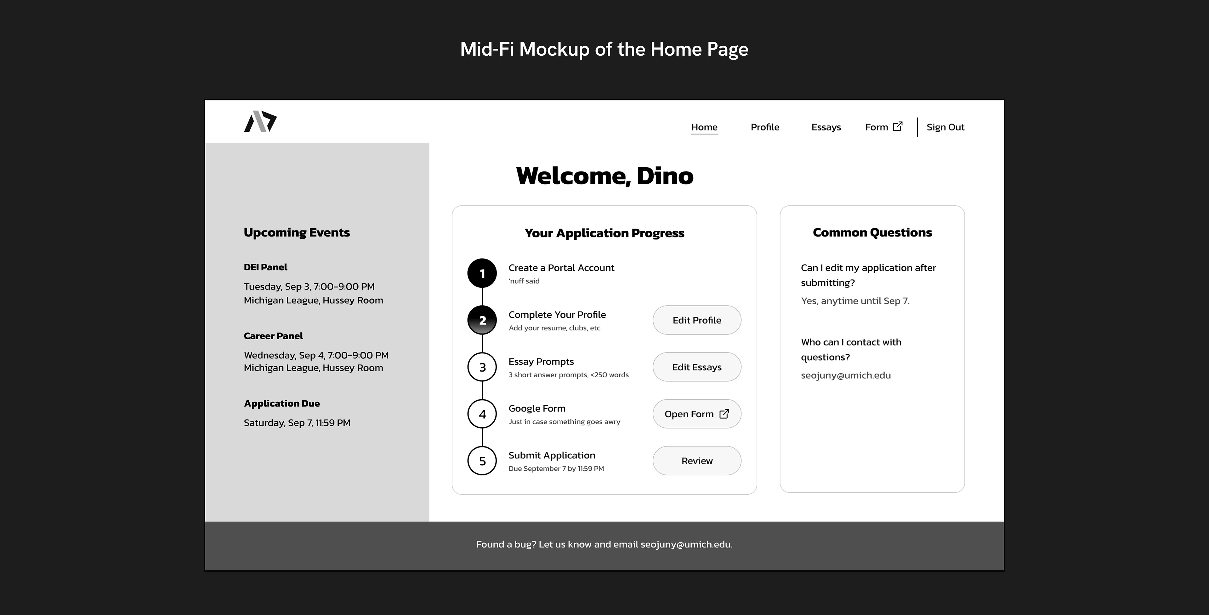
There’s a big change here; I’ve added a Submit Application step for applicants to review a summary of their application materials before submitting their application.
Wait, what? There wasn't a submit button?
Technically, there’s no need for one. The application portal acts like a running tab; any time applicants edit their application before the deadline, that change becomes part of their official submission.
While this change received positive feedback in usability testing, further discussion with SWE highlighted that it would be technically difficult to implement in time.
After discussion, we decided to create a Summary page for this release instead. The Summary page would allow applicants to see what information was missing from their application, but would not contain a submit button.
Issue 2:
Inaccurate Profile Info
Why is it difficult for applicants to fill out their profile information? Two reasons:
1. It must be edited in two places
2. The dropdown menus are unintuitive
1. It must be edited in two places
2. The dropdown menus are unintuitive
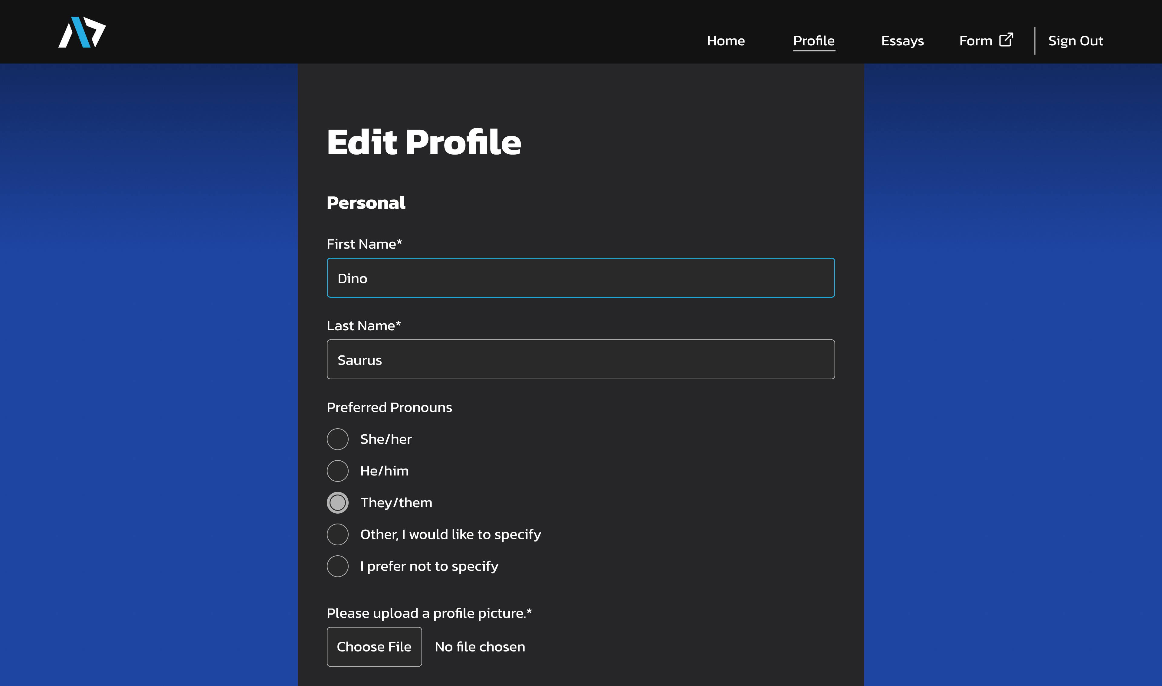
Previously, profile information was divided into two pages: Account Creation and the Profile page.
Why is this a bad thing?
Inaccurate Applications
Inaccurate Applications
If it’s not edited, the profile page is submitted with default values, meaning that some applicants may have accidentally applied as a software analyst graduating in Winter 2028. These details play a role in evaluating applicants fairly and maintaining a balance within the club, posing issues if that information turns out to be incorrect later on.
Losing Talent
Losing Talent
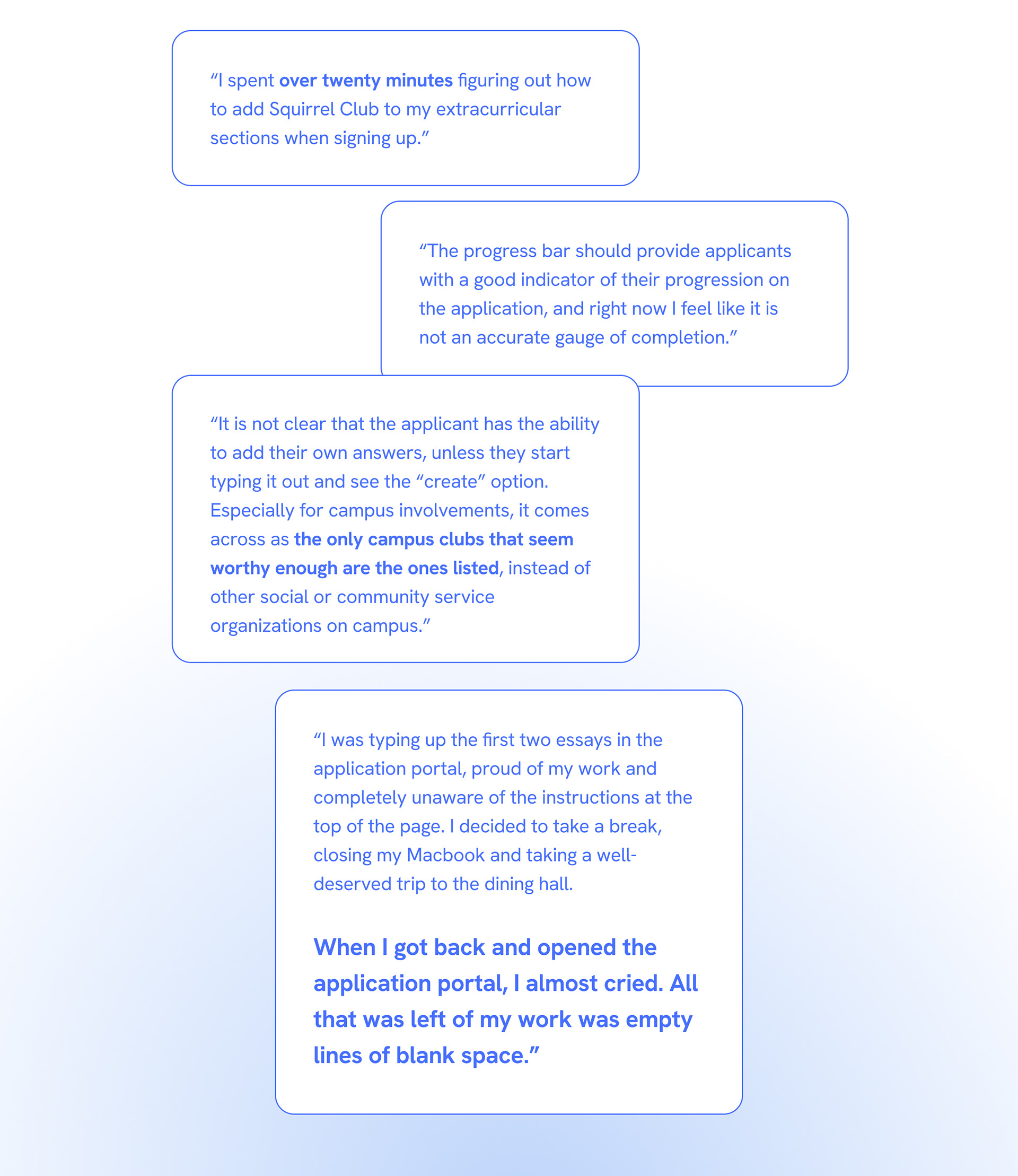
If people feel barred from adding information that accurately reflects them, they may feel discouraged from applying, limiting the diverse perspectives that could enrich the org. Such sentiment was reflected in feedback we received from previous applicants.
“ It is not immediately clear whether users can input options that are not included in the dropdown menus. This might give the impression that certain people should not apply because they are not in the pre-selected majors or in the pre-selected organizations . . . ”
So, what can be done?
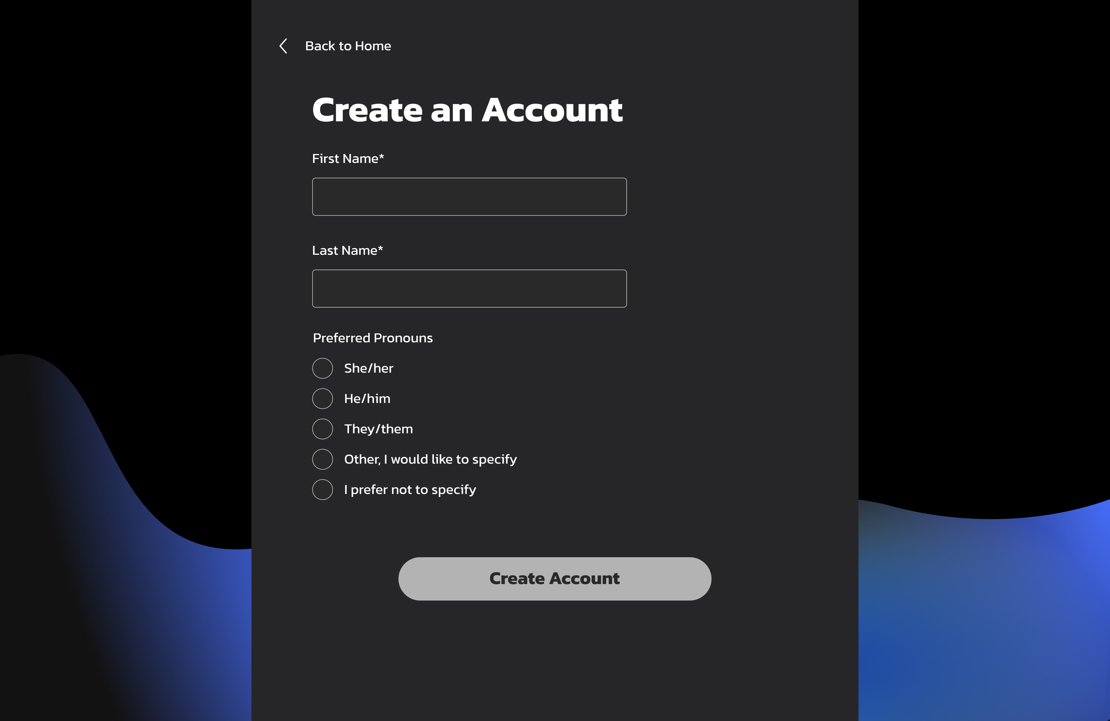
The Account Creation Page is the entryway into the portal. To reduce friction to sign up and begin an application, I moved the bulk of the fields from the sign up flow to the Profile page.
The Account Creation Page is the entryway into the portal. To reduce friction to sign up and begin an application, I moved the bulk of the fields from the sign up flow to the Profile page.

Revised Account Creation Page
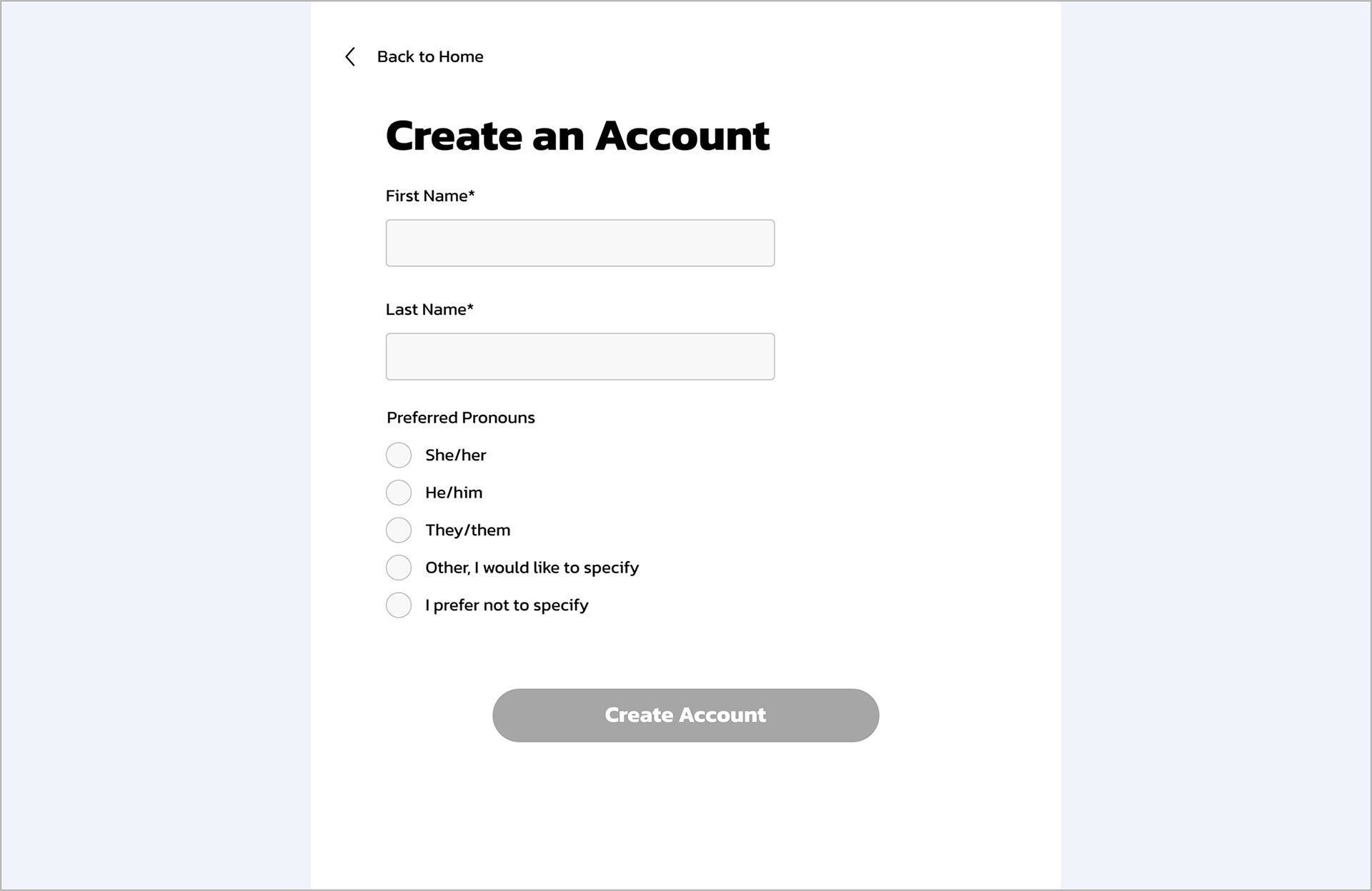
A mockup of the Account Creation page with minimal friction to enter the portal.
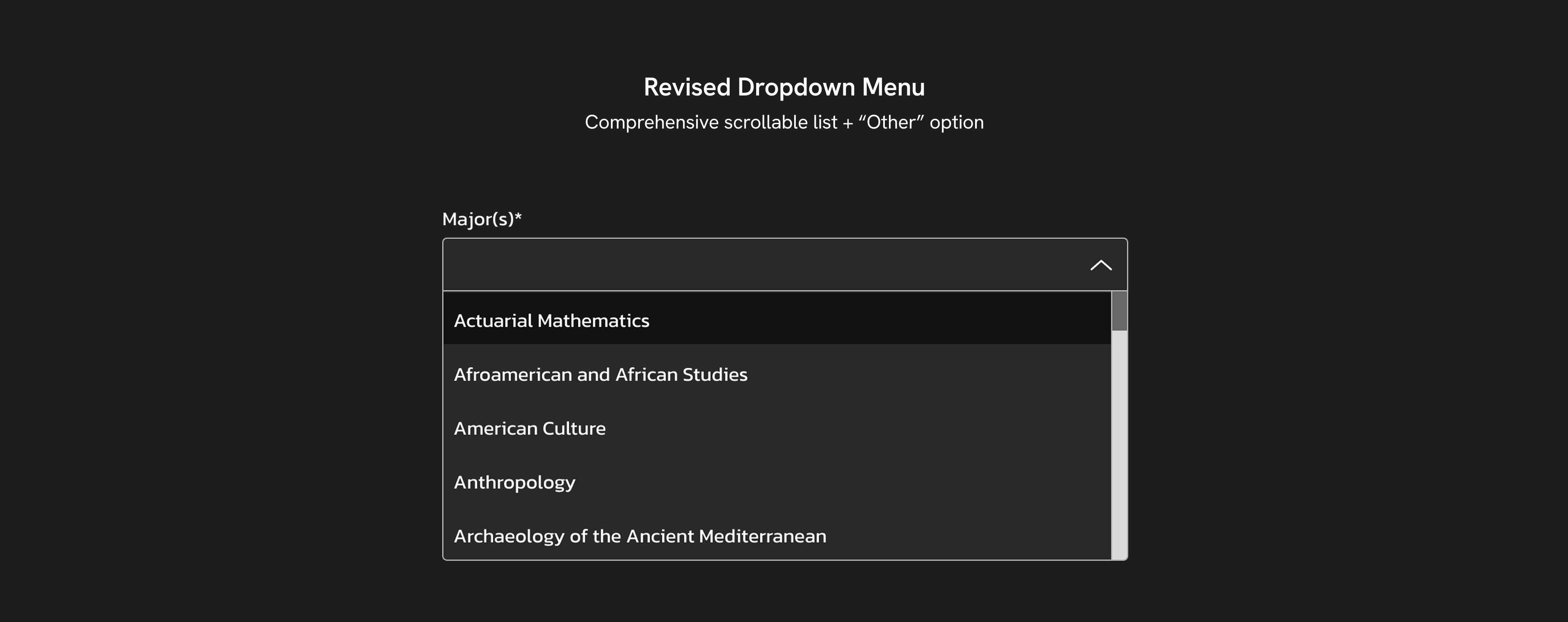
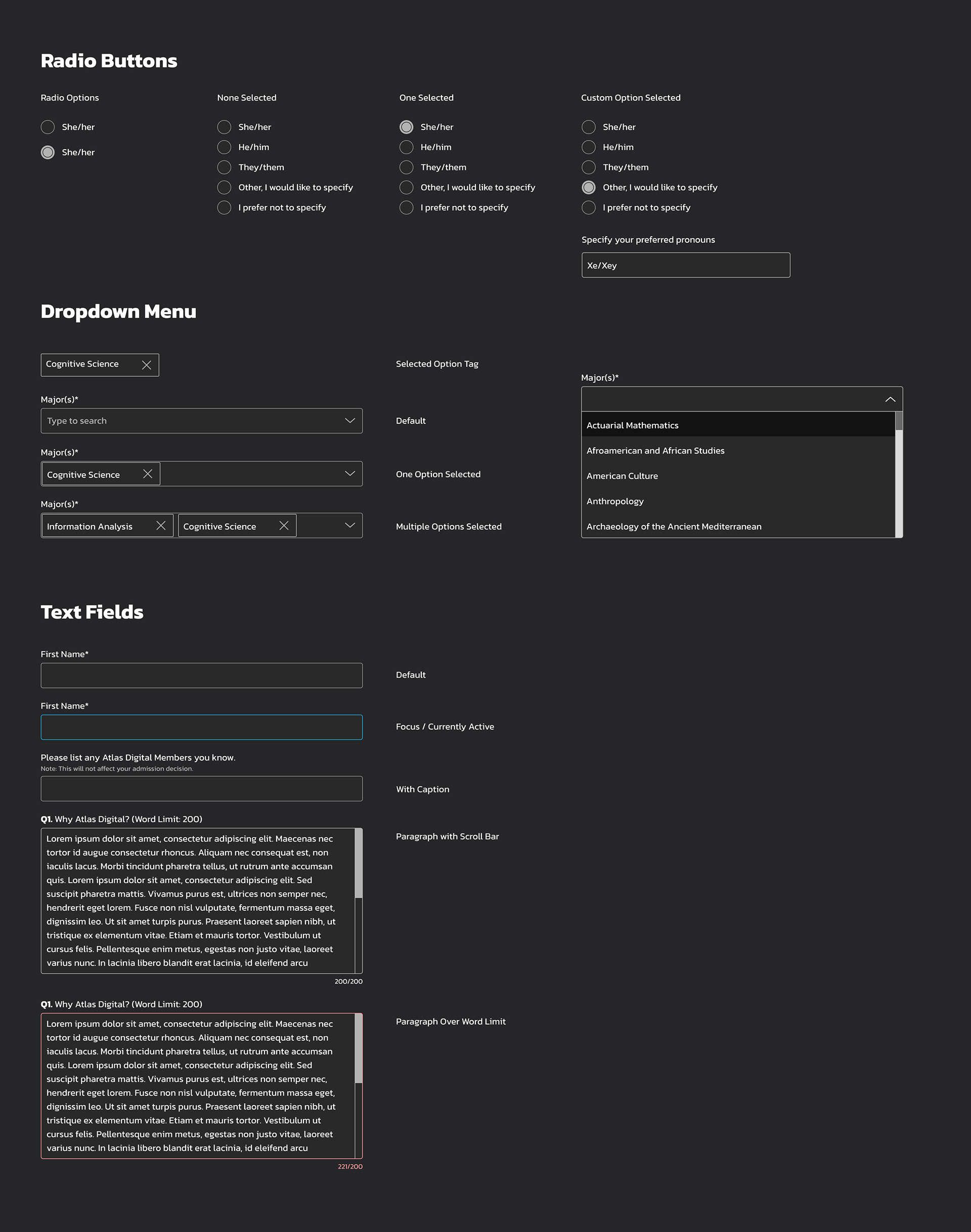
Now let’s take a look at those dropdown menus. On both the Account Creation and Profile pages there are several dropdown menus. Each menu has a short list of options to choose from. If the desired option isn’t available, users can type in a custom response to create a new option.
This issue was people didn’t realize they could type a custom response, meaning that some fields such as their major, minor, and coursework seemed limited to the select STEM ones listed.
This issue was people didn’t realize they could type a custom response, meaning that some fields such as their major, minor, and coursework seemed limited to the select STEM ones listed.
I tested a few different versions of the dropdown menu with placeholders or other descriptive messaging to prompt users to type their own option.
Usability Test With Dropdown Menus
Task: "Add two majors, Cognitive Science and Information Analysis"
Version 1
Version 2


So which one succeeded?
As it turns out . . . both versions failed.
During usability testing I asked participants to add two majors, one that was listed in the dropdown and one they would need to type to create. This task could not be completed in either version, as users would assume that the only options were those listed in the dropdown.
One person remarked that they would expect and prefer all of the possible majors to be listed in the dropdown menu with a scroll bar, as that is what they are used to seeing on other forms.
After discussing with SWE, we decided to include comprehensive dropdown lists for fields with categorized responses (including applicants’ major and minor), along with the option to select “Other.”
Visual Design
For the design direction I took inspiration from the organization's website, with some alterations to standardize the look and feel for a wide range of functions.
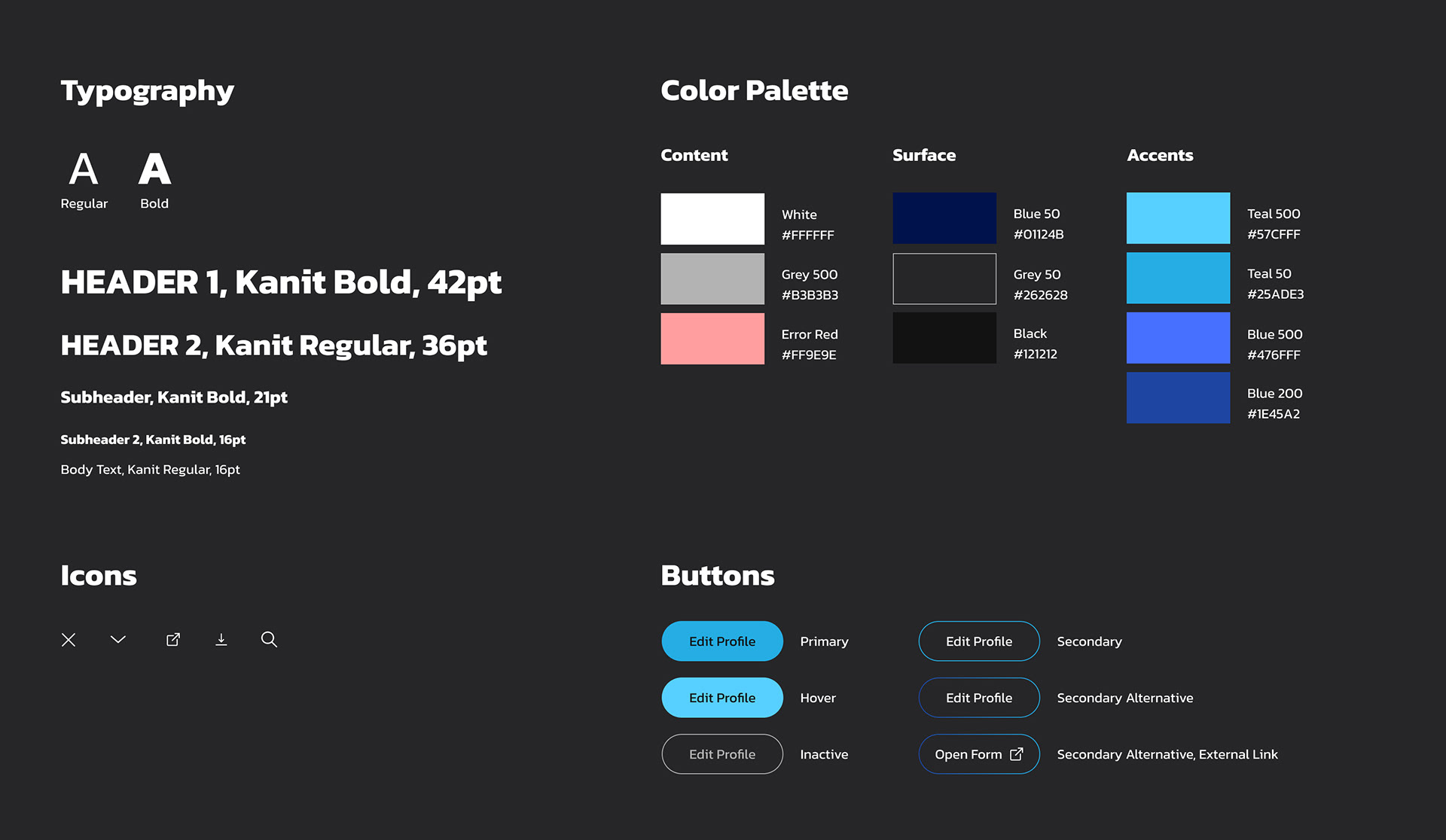
A style guide I created for the Application Portal.
A few components I prototyped for the form inputs.
Development and Outcomes
After weeks of calls, design iteration, and QA syncs, the portal launched on time! A few stats after the fact:
• 348 portal sign ups in 1 week
• 156% increase in unique majors, with 36 total majors represented
• Zero external recruitment systems used in the recruitment cycle
Reflections
1. Communicate early and often
Establishing more frequent communication had an incredible impact on the productivity of our team, especially working remotely (and at one point, in different time zones). Leveraging the developer's expertise of the back-end implementation allowed me to focus on features that could be edited under the time constraint, and my knowledge from user feedback allowed me to communicate high-priority design changes to the developers, such as making form inputs more intuitive.
2. Nothing too small
Even something as small as the dropdown menu can disrupt the user flow and lead people to feel blocked or dismissed. On the other hand, a congratulations message can be memorable enough to color the whole experience positively. Paying attention to the small details can can be just as rewarding (if not more) as broader changes.