Bin Locator
Waste Wise App
Role
UX Designer
Team
Kylie Ho, UX
Fahmida Rahman, UX
Fanny Raskind, UX
Skills
User Research, End to End Design, Mobile App Design
Figma Wireframing and Prototyping
Timeline
September - December 2024
Overview
Say you’re in a rural town in Michigan. You just moved in (congrats!) and as you’re unpacking cardboard boxes of moving items, you look to see where the recycle bin has gone. Hmm, doesn’t look like it’s in the garage. Or outside. No matter where you look, around your house, in your email, you won’t find a recycling bin for your new home, because in fact, it doesn’t exist.
In cities across the United States, there isn’t a standardized waste management system, increasing the barrier for young adults to form sustainable practices. Our app, Waste Wise, targets this issue by enabling individuals to schedule pick-up services and identify proper waste bins using an AI camera, increasing the convenience, accessibility, and education of waste management.
My work focused on the Landing, Map, and Profile pages of the mobile app.
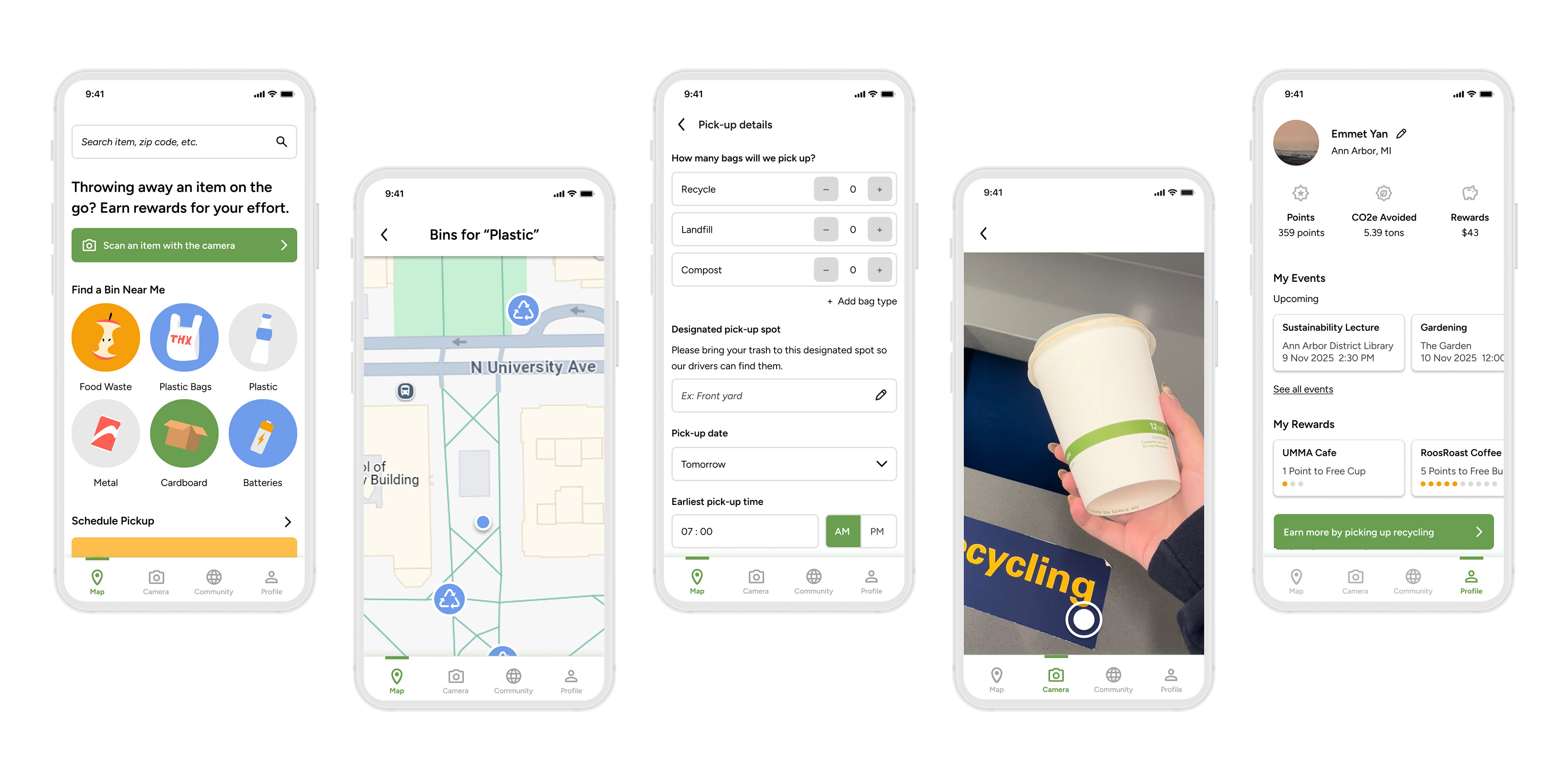
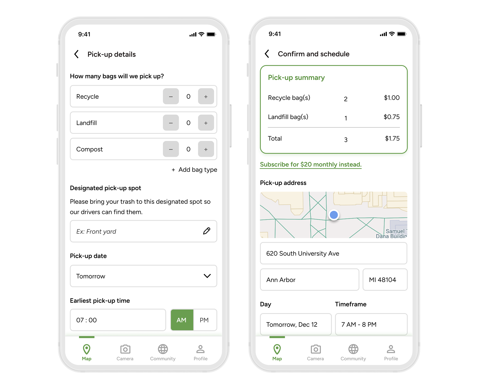
Waste Wise offers a series of features including a waste bin locator, pick-up service, and waste-sorting camera.
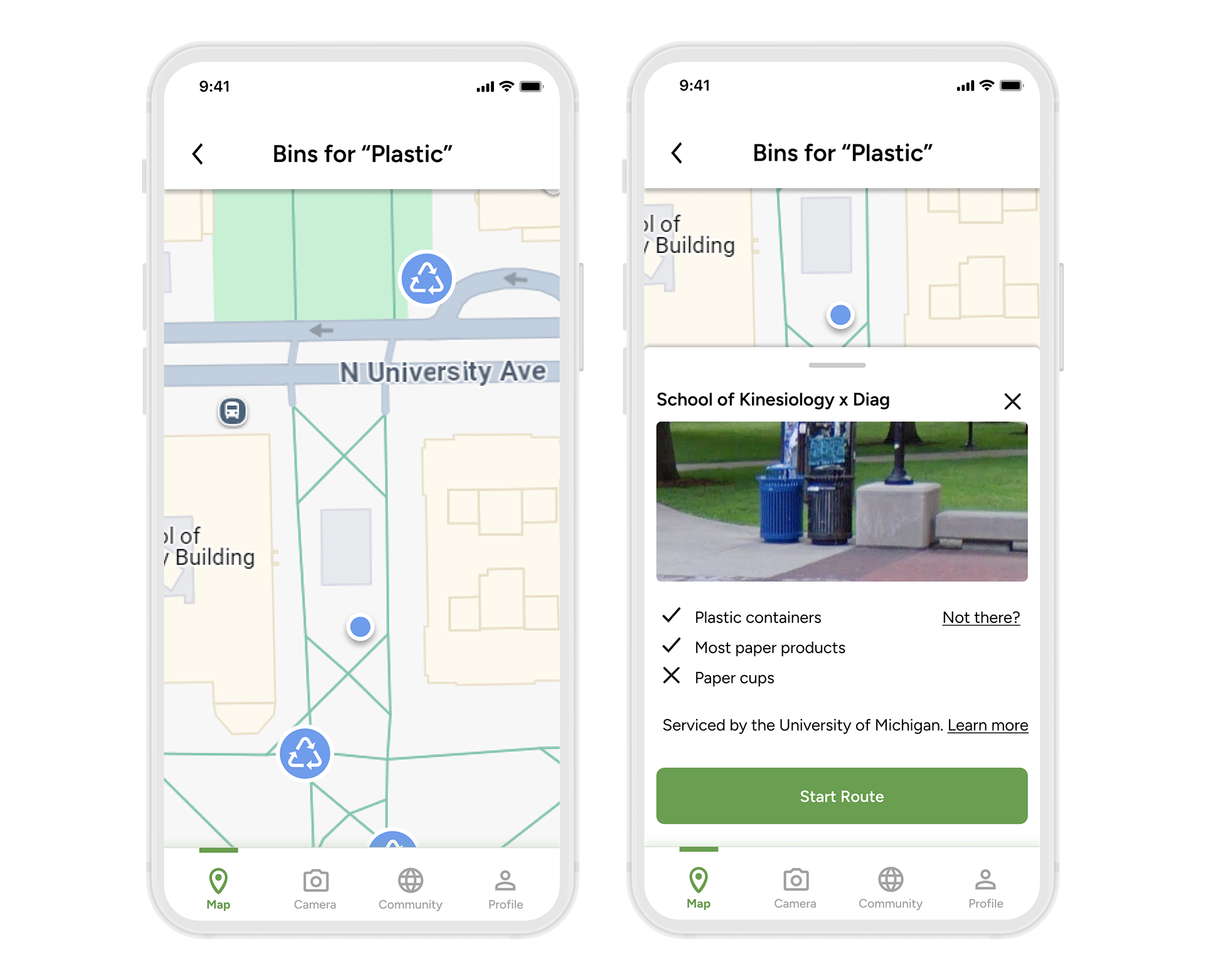
Find a bin near you.
Navigate to bins with in-app routing.
Background
After conducting 9 interviews among young adults interested in sustainability, we found three key pain points:
❌ Access - Where do I find proper waste bins?
❌ Convenience - How do I reach them?
❌ Education - How do I sort waste?
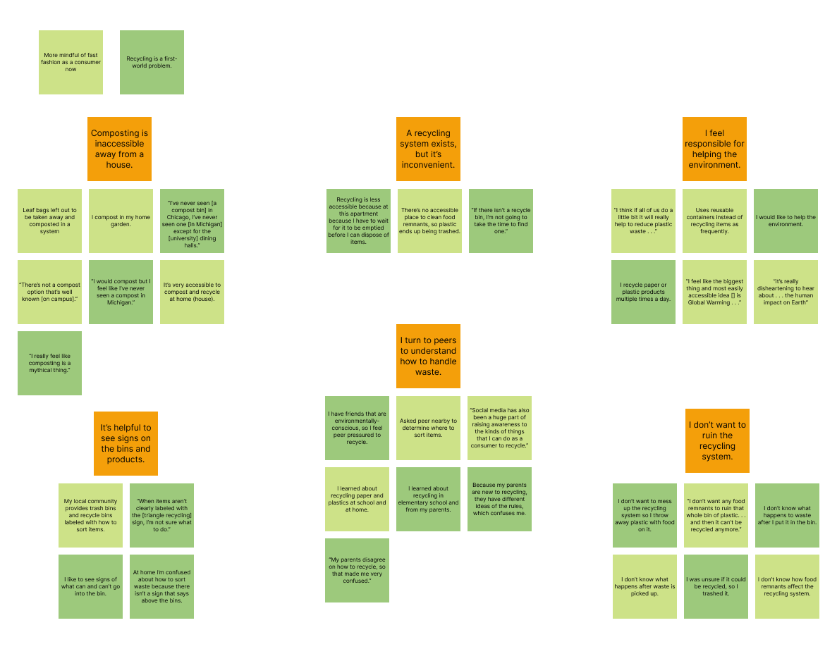
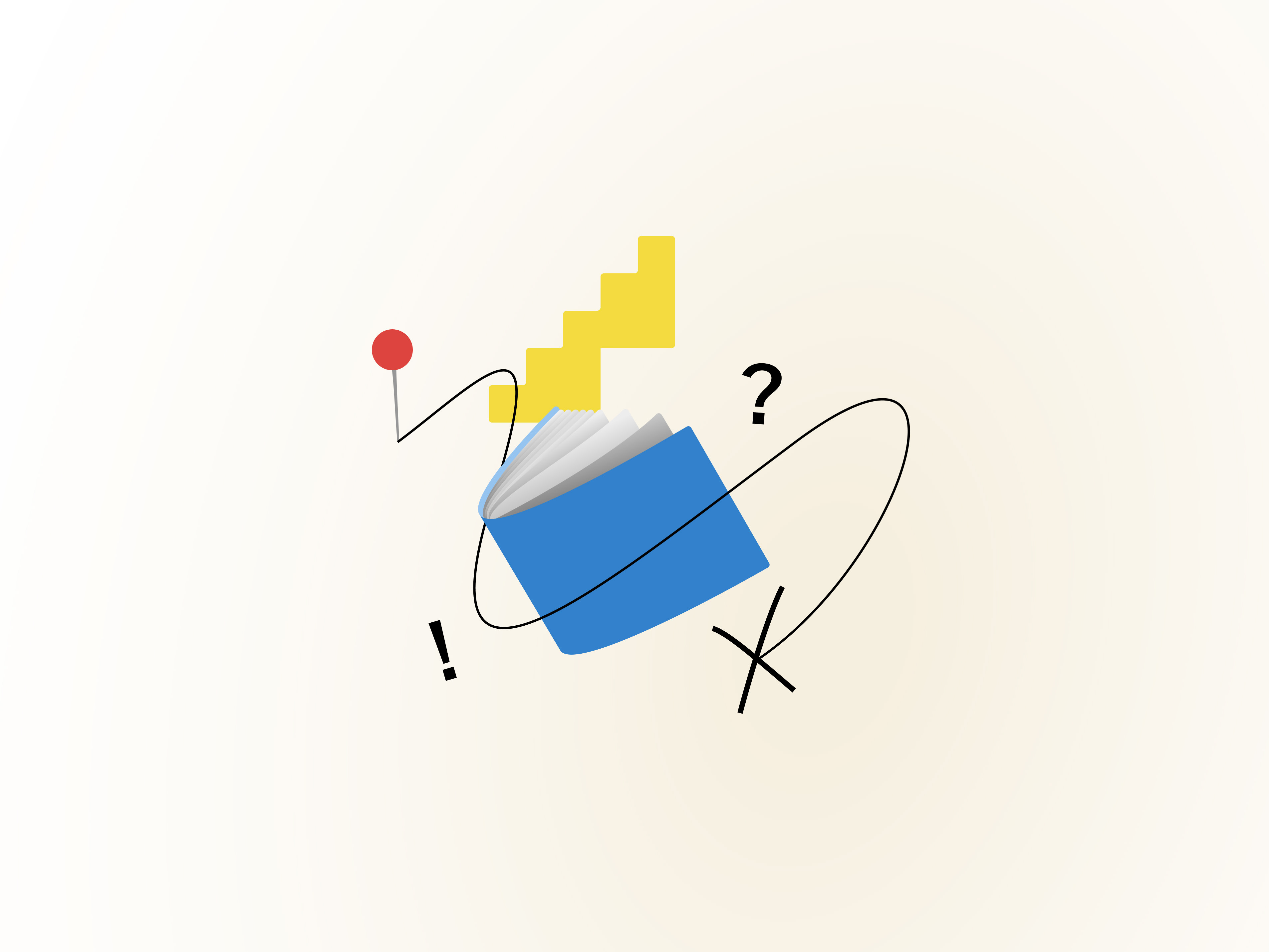
I used an affinity diagram to extract preliminary issued across the user interviews I conducted.

In addition to these pain points, a comparative analysis showed that existing solutions struggle to provide explicit recycling instructions that adapt to different communities, and none of the examined products provided thorough guidance on how to sort waste so that it can be properly processed.
We decided that an app would be most accessible to our audience without the need to purchase additional technology, while still empowering them to learn and make informed decisions about waste management.
The Goal
Encourage sustainable habits by educating young adults on how and where to recycle or compost items.
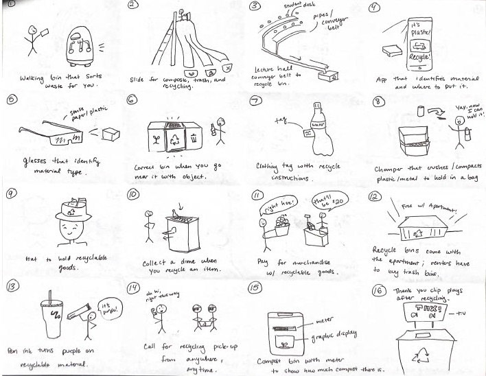
Iteration
Before beginning wireframes, our team first mapped the architecture of the app with a user flow diagram.
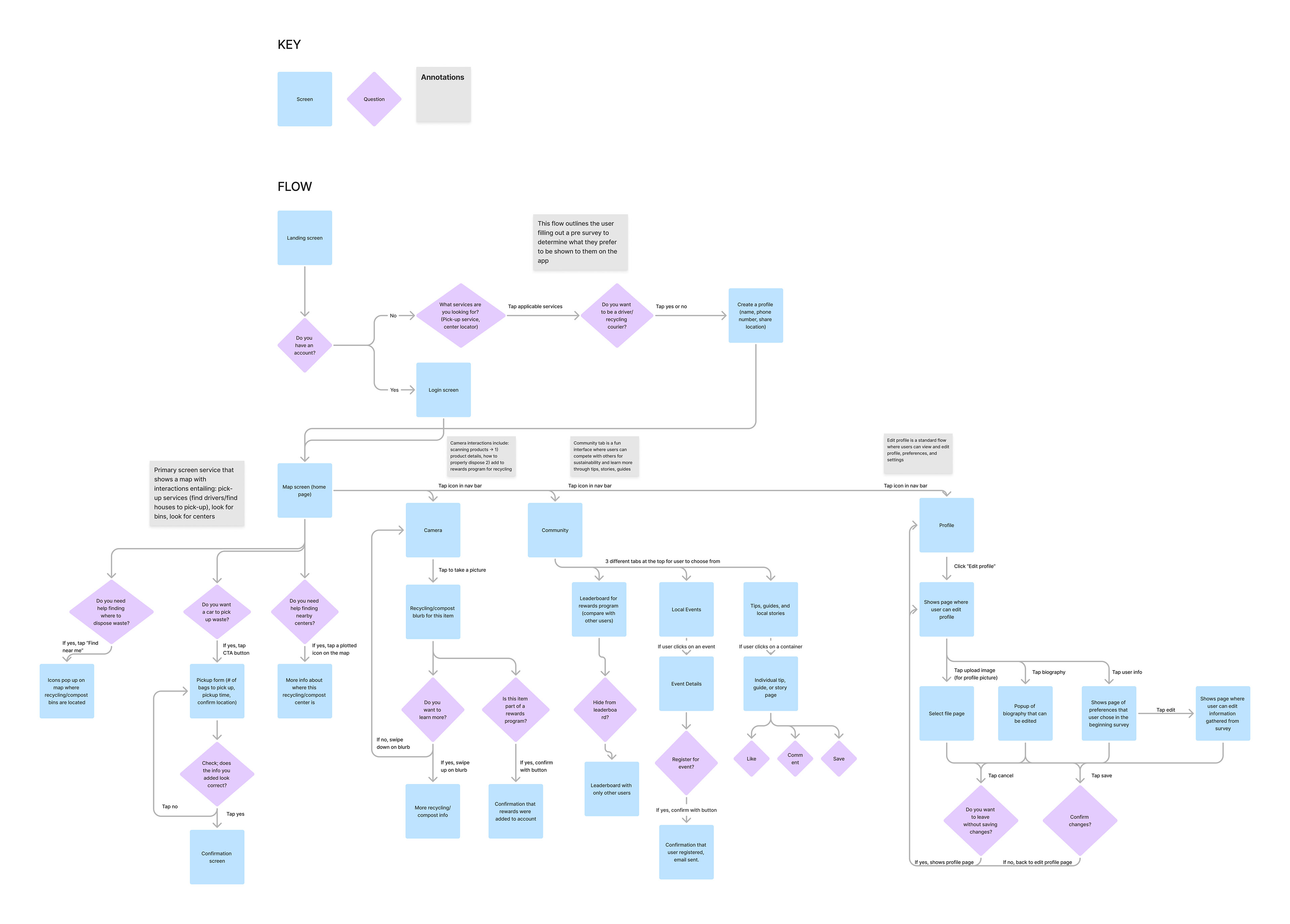
A user flow diagram showed how users would reach different pages.
Our team discussed using interactive map act as the landing page, but decided that this would be infeasible for users who decide to disable location services. Instead, the landing page would to act as a central hub that led to the main app features.
As I was iterating through the landing page, I considered what knowledge users might approach the app with. I decided to proceed with the fourth iteration of the page as it would allow users to continue the process of locating a bin using information they would have at hand--the product they're trying to toss.
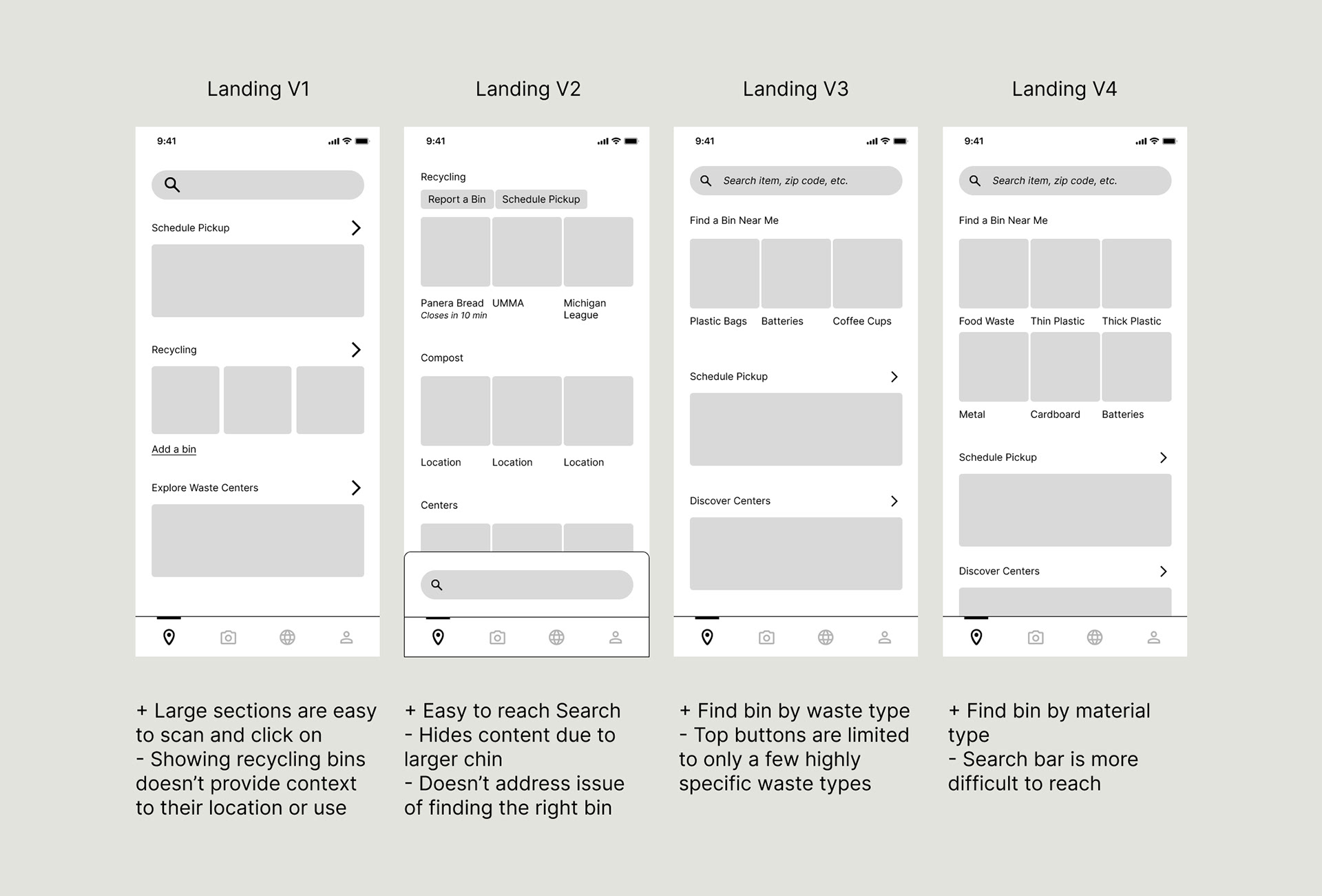
Iterations on the landing page as I transformed the rough sketch into a wireframe.
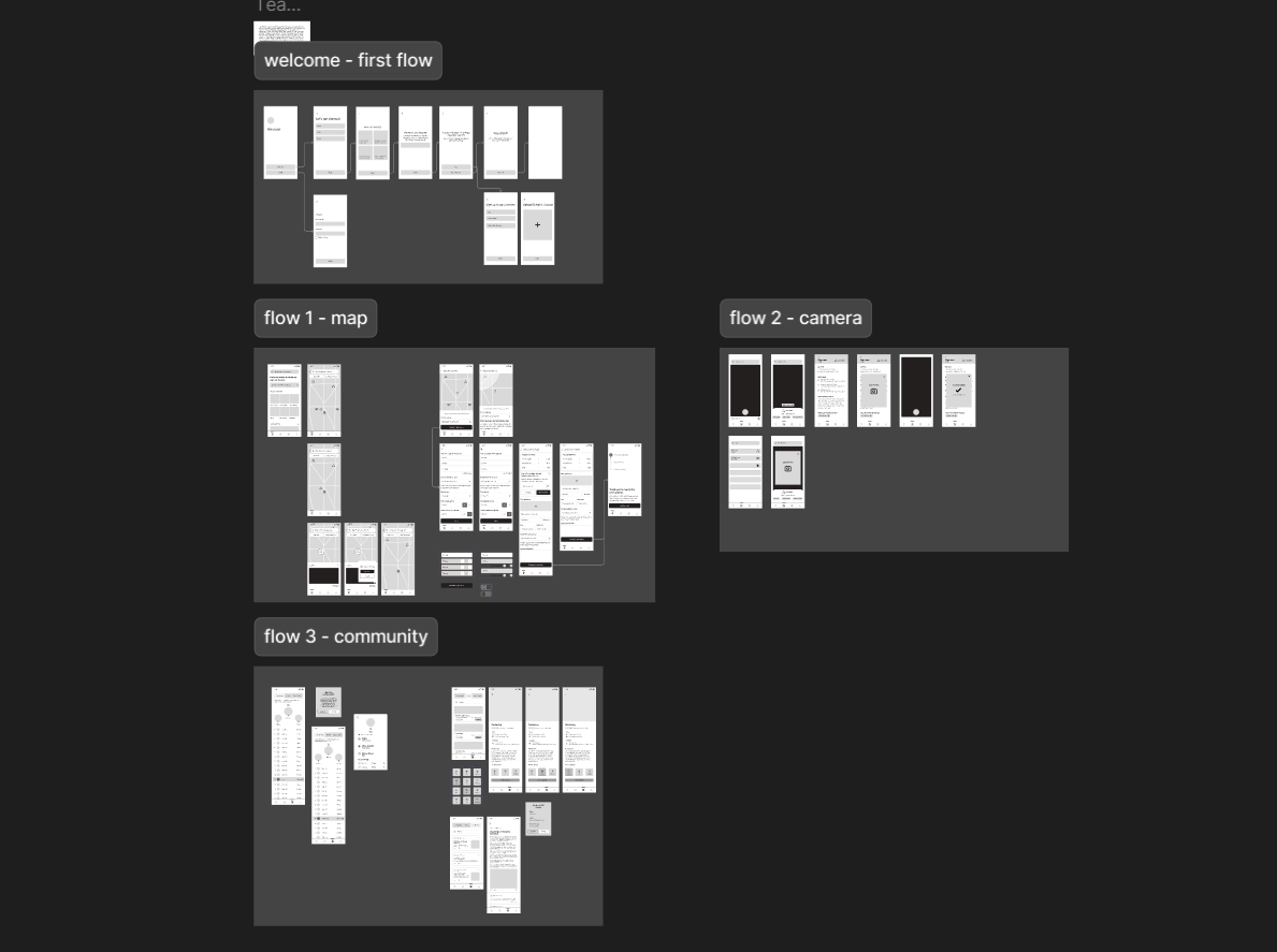
The lo-fidelity prototype connects the landing page to the map, camera, and community pages.
While participants were successfully able to locate bins in usability testing, they found it difficult to understand the reward feature.
Because users didn't realize that they needed to take a picture to confirm that they have recycled an item, they didn't think to go to the camera page to collect rewards. To remedy this, I added a callout from the landing page to explicitly connect the two, and my team member added a pop-up on the camera page that would further explain the reward mechanism.

A banner was added to direct users to the camera page for rewards.
Refining the Visual Design
Our team collaborated to create a style guide that would convey an cohesive and lively feel. We selected a sans-serif typeface for its legibility at several font sizes, while still complimenting the rounded UI elements included throughout the app.
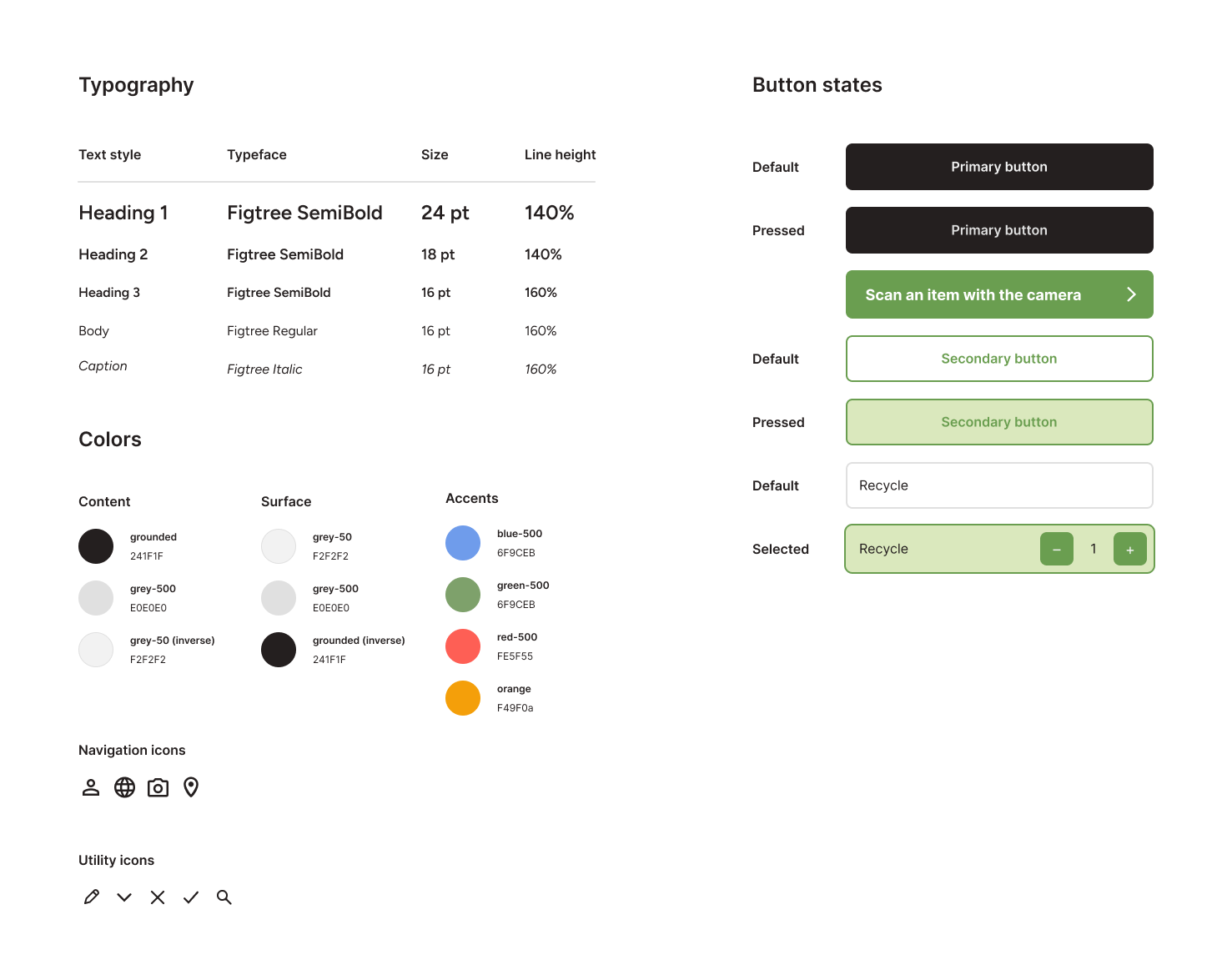
The Waste Wise style guide.
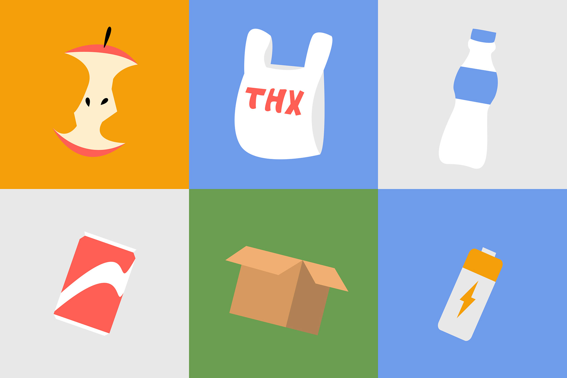
Vector graphics I created for the Home screen to align with the saturated color palette and playful brand feel.
Results
✅ Access
Find nearby waste bins and local waste management centers on a dynamic map
✅ Convenience
Schedule a pickup if there isn't a local recycling service

✅ Education
Scan items with the camera to read about where to recycle them and how they're processed in this city
Here's what people are saying about Waste Wise:
"I like the home screen. It's nice and clean. I love the simple images that you used!"
"I also love the map of where bins are, [it] would be so helpful on long drives."
"I love the graphics/style of this app! I also love the addition of the graphic bubbles to select the type of recyclable . . . "
Takeaways
1. Teamwork is more than splitting the work
Although our team had initially divided the design work by app section, we later found it valuable to critique and iterate across screens in favor of creating a consistent experience. As I reviewed other screens, I found myself learning new techniques within Figma, a tool I thought myself comfortable in. Because of this, I was able to push my visual design and prototyping skills farther.
2. Small joys with big impact
While the illustrated buttons on the home screen were a relatively small part of the overall user experience, several people shared their appreciation for it in their feedback. It shows how small details can make an experience more impressionable.